UX Strategies for Digital Payment Platforms
Author
Vignesh
Published On

Digital payments are now table stakes for modern businesses, but many payment experiences still lose users mid-transaction. For startups and product teams in FinTech, every abandoned payment is lost revenue, lower LTV, and weaker product-market fit. This post maps the real-world problems payment startups face, explains why most products struggle to scale, and delivers a step-by-step UX strategy you can apply today to improve trust, completion rates, and long-term retention. Read on for an actionable framework, measurable outcomes, and how a UX audit can accelerate growth.
Digital Payment Platforms Lose Users Before Transactions Are Completed
Here is the uncomfortable truth most FinTech product teams avoid: the majority of user drop-off doesn't happen because of pricing, competition, or poor marketing. It happens because the experience itself creates doubt, confusion, and friction.
Consider this real-world scenario: A first-time user downloads a mobile payment app after seeing a compelling ad. They open the app, encounter a 12-step KYC verification process with no progress indicator, then land on a dashboard so dense with information that they cannot figure out how to send money. They close the app. They never return.
This is not a hypothetical. It happens thousands of times per day across FinTech platforms globally. The data is unambiguous:
77% of users abandon a mobile app after their first use (Localytics)
Users form a first impression of a digital product in as little as 50 milliseconds
A 1-second delay in page load time can reduce conversions by 7% (Akamai)
FinTech onboarding flows with more than 5 steps see 40%+ drop-off rates
The gap between a user downloading your app and a user completing their first transaction is the most dangerous moment in your entire product lifecycle. UX strategy is what bridges that gap.
Common UX Challenges Faced by Digital Payment Startups
Before we discuss solutions, we need to name the problems precisely. These are the UX failure patterns we see most consistently when auditing digital payment products:
Trust Deficit on First Impression: New users arrive skeptical. Financial products must earn trust within seconds and most fail to do so through visual design, microcopy, and transparency signals.
Onboarding Overwhelm: Regulatory requirements (KYC, AML compliance) force complexity onto users. Most platforms dump this complexity on users without intelligent sequencing or contextual guidance.
Opaque Transaction Flows: Users are forced to make irreversible financial decisions with insufficient information, no confidence indicators, and poorly timed confirmation steps.
Destructive Error Handling: Generic error messages like 'Transaction failed. Try again.' tell users nothing and create anxiety. Unclear recovery paths abandon users at their most vulnerable moment.
Mobile Experience Negligence: Many FinTech platforms are designed desktop-first and retrofitted for mobile resulting in cramped layouts, difficult tap targets, and broken payment flows on the devices most users actually use.
Financial Literacy Gaps: Platforms that assume user sophistication lose users who don't understand fee structures, currency conversions, or account terminology.
Accessibility Blindspots: Accessibility is treated as a compliance checkbox rather than a growth lever leaving significant user segments underserved and creating legal risk.
Why Most Digital Payment Products Struggle to Scale
Scaling a digital payment platform is not primarily a marketing or engineering challenge it is fundamentally a design and trust challenge.
Most payment startups hit the same growth ceiling: strong early adopter traction followed by stagnating retention numbers, poor word-of-mouth, and ballooning customer support costs. The root cause is almost always a fragmented user experience that erodes confidence over time.
Here are the structural UX reasons digital payment products fail to scale:
They optimize for feature breadth over experience depth adding capabilities before fixing existing friction points.
They treat UX as a final-stage polish activity rather than a core strategic function embedded from product inception.
They invest in acquisition marketing while ignoring the UX leaks draining their retention bucket.
They lack a structured UX research practice, making product decisions based on internal assumptions rather than validated user behavior.
They neglect the emotional dimension of financial products ignoring that users feel anxiety, confusion, and fear when interacting with anything that touches their money.
UX Strategies That Improve Digital Payment Experiences
The following nine strategies represent a comprehensive, battle-tested framework for building payment experiences that earn trust, reduce friction, and convert users into loyal, paying customers.
Design for Trust From the First Interaction
Trust is the currency of financial products. Before a user enters their card number, links their bank account, or sends a single payment, they are unconsciously evaluating whether your platform is safe, credible, and competent.
Trust-building UX is not accidental. It requires deliberate design decisions at every touchpoint:
Visual credibility signals: Professional, consistent design language with appropriate use of white space, brand color, and typography communicates institutional reliability.
Transparent security communication: Display encryption standards, security certifications, and compliance marks (PCI-DSS, SOC 2, ISO 27001) contextually not buried in a footer.
Social proof integration: User counts, transaction volumes, and recognizable partner logos reduce perceived risk during onboarding.
Microcopy precision: Every label, tooltip, and instructional text should be crafted to reduce ambiguity and project competence. Words like 'bank-level security' and 'protected by 256-bit encryption' meaningfully increase completion rates.
Trust UX is the first filter. Users who don't trust your product in the first 30 seconds will never complete a transaction.
Simplify User Onboarding
Onboarding is the highest-stakes UX sequence in any financial product. It is simultaneously where regulatory complexity is highest and where user motivation is most fragile.
The strategic approach to onboarding simplification involves three principles:
Progressive disclosure: Collect only the information you need at each stage. Don't ask for tax identification numbers before a user has experienced core product value.
Contextual guidance: Explain why you need sensitive information at the exact moment you request it. 'We need your ID to comply with financial regulations and protect your account' converts significantly better than a blank input field.
Progress visibility: Display clear progress indicators throughout multi-step flows. Users will tolerate complexity when they can see the finish line.
Benchmark: Best-in-class FinTech onboarding achieves first-session activation (first successful transaction) within 7 minutes. If your onboarding takes longer, you have a measurable UX opportunity.
Create Frictionless Payment Flows
Every unnecessary step in a payment flow is a conversion leak. The goal of payment flow design is to reduce cognitive load and decision fatigue while ensuring users feel informed and in control.
High-performance payment flow design principles:
Default to the user's most recently used payment method to reduce selection friction
Implement smart form fields that auto-format card numbers, expiry dates, and account numbers
Use inline validation rather than end-of-form error summaries
Reduce the number of screens between 'initiate payment' and 'payment confirmed' to an absolute minimum
Provide clear, prominent CTA buttons with action-oriented labels ('Send $50' vs. generic 'Submit')
Allow users to review and edit before final confirmation without losing previously entered data
Improve Error Prevention and Recovery
In financial UX, errors are not inconveniences they are trust-breaking events. How your platform handles mistakes defines the long-term relationship you have with your users.
Error prevention starts upstream: design flows that make incorrect actions difficult. Use input constraints, smart defaults, and confirmation dialogs for high-risk actions (irreversible transfers, large amounts).
When errors do occur, your error UX must:
Explain what happened specifically: Not 'Transaction failed' but 'Your card was declined due to insufficient funds. Please check your balance or use a different payment method.'
Provide clear recovery paths: Every error state should include a direct action the user can take immediately.
Preserve user input: Never clear form data after an error. Requiring users to re-enter information they already submitted is one of the most cited reasons for payment abandonment.
Maintain emotional tone: Error messages should be calm, helpful, and non-accusatory. The user is not the problem.
Build Confidence During Transactions
The moment between clicking 'Pay' and seeing a confirmation is the peak anxiety moment in digital payment UX. Users need continuous reassurance that their money is safe and their transaction is progressing.
Confidence-building design during transactions includes:
Animated progress indicators with status descriptions ('Connecting to bank... Verifying payment... Processing...')
Real-time feedback for every user action during the payment flow
Immediate, unambiguous confirmation screens with transaction details, reference numbers, and next steps
Post-transaction communication (in-app notification + email) that reinforces successful completion
Transparent timeline communication for transfers that aren't instant ('Your payment will arrive within 1-3 business days')
Optimize Mobile Payment Experiences
Mobile is the primary interface for digital payments globally. By 2025, mobile payment transaction volume surpassed desktop in every major market. Yet most FinTech teams still design mobile as a reduced version of their web experience rather than as the primary product.
Mobile-first payment UX requirements:
Touch-optimized targets: Interactive elements must be a minimum of 44x44 points (Apple HIG standard). Small tap targets generate errors and frustration on mobile.
Biometric authentication: Implement Face ID, Touch ID, and fingerprint authentication for returning users. Forcing password entry on every session is a mobile UX failure.
Native keyboard optimization: Trigger numeric keyboards for card and account number fields. This single change measurably improves mobile form completion rates.
Thumb-zone design: Place primary action elements within natural thumb reach. Critical CTAs should not require full-hand stretches to reach.
Offline state handling: Mobile users frequently lose connectivity. Your app must handle connection failures gracefully without data loss or transaction errors.
Design Effective Payment Failure Recovery Experiences
Payment failures are inevitable. Card declines, insufficient funds, network timeouts, and bank system outages will affect a percentage of your users in every session. The question is not whether failures happen it is whether your UX recovers those users or loses them permanently.
A payment failure recovery framework should include:
Immediate, clear failure communication with specific reason (where possible and compliant)
Alternative payment method prompts don't let a failed card end the session
Save-for-later functionality allow users to complete setup and return without re-entering data
Proactive support access surface live chat, help articles, or callback options from within the failure state
Re-engagement sequences automated follow-up for users who abandoned after a payment failure
Platforms that invest in failure recovery UX routinely recover 15-25% of transactions that would otherwise be permanently lost.
Make Financial Information Easy to Understand
Financial literacy is not equally distributed. Your platform's users range from sophisticated investors to first-time digital banking customers. Designing for the sophisticated user while ignoring the beginner is a growth-limiting strategy.
Financial information clarity principles:
Plain-language labels: Replace 'Beneficiary Remittance Reference' with 'Payment Note' and watch completion rates improve.
Contextual tooltips: For every financial term that might confuse a non-expert user, provide an instantly accessible explanation without requiring the user to leave the flow.
Visual data representation: Use charts, graphs, and progress visualizations to communicate account balances, spending trends, and financial goals. Data visualized is data understood.
Fee transparency upfront: Display all fees before a user commits to a transaction. Hidden fees discovered post-transaction are the single greatest driver of FinTech churn.
Spending summaries: Automatic categorization and clear transaction history help users feel in control of their financial activity increasing engagement and retention.
Accessibility as a Competitive Advantage
Accessibility is consistently treated as a compliance exercise in FinTech product development. This is a strategic error. The global population of users with disabilities represents over 1.3 billion people (WHO). In financial services, this population is chronically underserved and disproportionately loyal to products that serve them well.
Accessibility implementation priorities for payment platforms:
WCAG 2.1 AA compliance as a minimum standard for all user interfaces
Screen reader compatibility for all payment flows critical for visually impaired users
Color contrast ratios that meet accessibility standards particularly important for error states and CTAs
Keyboard navigation for all interactive elements
Alternative text for all images, icons, and non-text content
Font size controls and legibility optimization for aging user populations
Beyond compliance: accessible design typically improves usability for all users, not just those with disabilities. Clarity, structure, and simplicity benefit everyone.
The Role of UX Research in Digital Payment Success
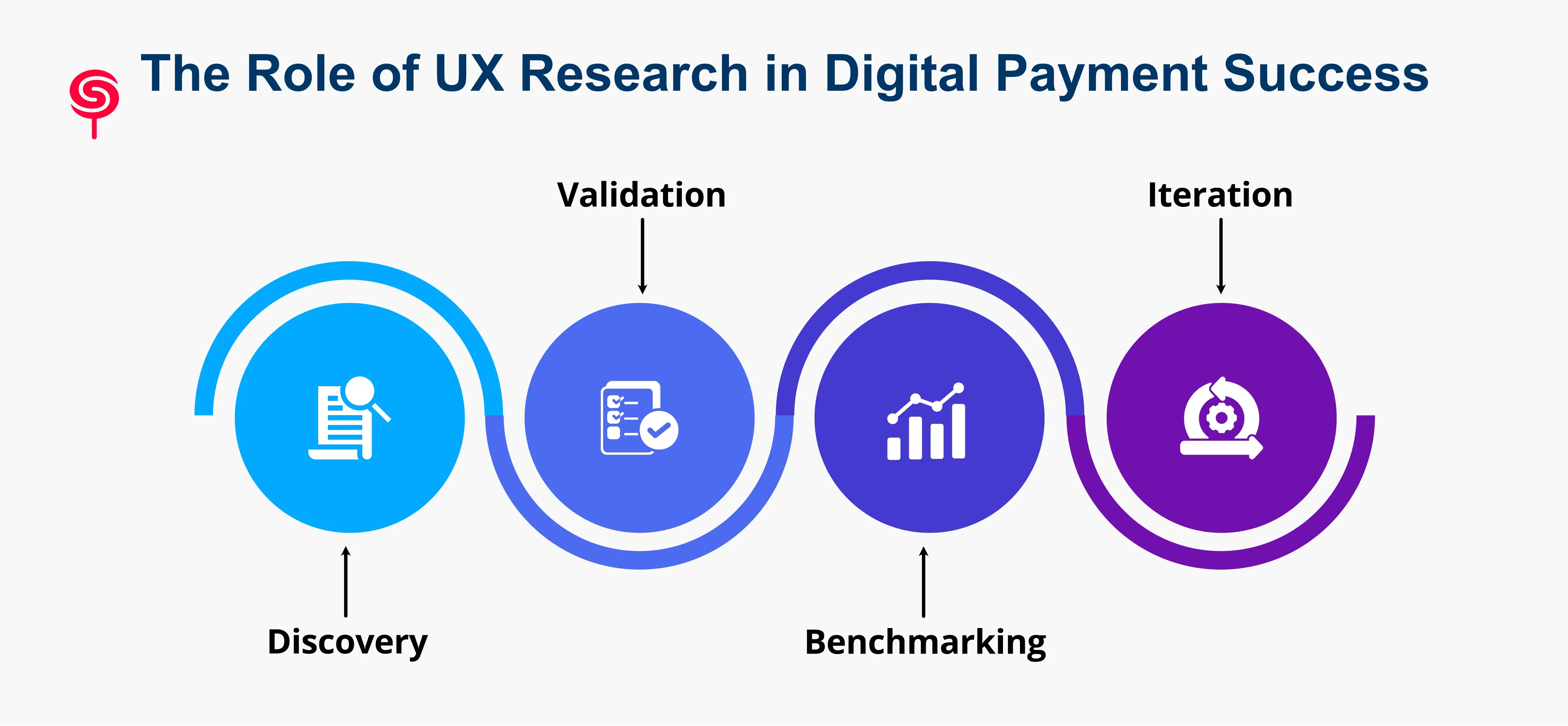
Strategy without research is guesswork. Every UX strategy outlined in this guide should be validated, refined, and prioritized through a rigorous user research practice.
For digital payment platforms specifically, UX research serves four critical functions:
Discovery: Identifying unknown friction points, unmet user needs, and behavioral patterns that internal teams cannot see because they are too close to the product.
Validation: Testing design hypotheses before development investment ensuring that the solutions you build actually solve real user problems.
Benchmarking: Establishing baseline metrics for task completion rates, error frequency, time-on-task, and satisfaction scores that inform prioritization decisions.
Iteration: Continuous feedback loops that improve product experience in response to real user behavior, not internal assumptions.
Research methods most applicable to payment UX include moderated usability testing, unmoderated remote testing, session recording analysis, funnel drop-off analysis, card sorting for information architecture, and in-depth user interviews focused on financial behavior and trust.
How Digital Prototyping and User Testing Reduce Payment Experience Risks
In financial product development, the cost of a UX mistake compounds rapidly. A poorly designed payment flow that ships to production doesn't just frustrate users in the moment it generates churn, negative reviews, customer support load, and in regulated environments, potential compliance exposure.
Digital prototyping and usability testing are the risk management tools that prevent these outcomes.
The prototyping and testing cycle for payment UX:
Wireframe core payment flows at low fidelity to test information architecture and flow logic before any visual design investment
Build interactive prototypes of high-stakes flows (onboarding, payment initiation, error states) for moderated usability testing
Conduct task-based testing with representative users observing behavior rather than soliciting opinions
Iterate on prototypes based on observed failure points before committing to engineering resources
Validate final designs with A/B testing and real-world conversion metrics post-launch
Teams that adopt this discipline consistently report 30-50% reductions in post-launch UX issues and significantly faster iteration cycles because problems are caught before they become expensive engineering fixes.
Business Outcomes of Investing in Payment UX
UX is not a cost center. For digital payment platforms, great UX is a direct revenue driver, a retention mechanism, and a competitive differentiator. Here is how UX investment translates to measurable business outcomes:
Increased Transaction Completion Rates: Optimized payment flows and trust-building design directly increase the percentage of initiated transactions that are completed. A 10% improvement in transaction completion on a $10M annual GMV platform is $1M in recovered revenue.
Reduced Customer Acquisition Cost: Products with exceptional UX generate organic growth through referrals, positive reviews, and word-of-mouth reducing paid acquisition dependency.
Lower Customer Support Costs: Every UX improvement that prevents confusion reduces inbound support volume. Teams that invest in UX consistently report 25-40% reductions in support ticket volume following design improvements.
Improved User Retention and LTV: Retention is the most important metric in subscription and transactional FinTech. Users who have positive, consistent payment experiences renew, upgrade, and expand usage. Every percentage point of retained users compounds into significant lifetime value.
Higher App Store Ratings and Organic Growth: App store ratings are directly correlated with UX quality. A 0.5-star improvement in average rating can increase downloads by 14% (Apple App Store data). UX investment creates a flywheel of positive reviews that reduces acquisition costs.
Competitive Differentiation: In crowded FinTech markets, product features are easily replicated. UX depth and emotional resonance are significantly harder to copy and represent a durable competitive advantage.
Conclusion
Payments are critical conversion and trust touchpoints that require a disciplined, research-driven UX approach. By designing for trust, simplifying onboarding, preventing and recovering from errors, optimizing mobile flows, and implementing a repeatable measurement-and-testing framework, FinTech teams can significantly improve conversion, retention, and growth. If you’re seeing drop-offs at the payment stage, a focused UX audit identifies quick wins and builds a roadmap for sustainable improvement.
Frequently Asked Questions
1. What is FinTech User Experience?
FinTech User Experience refers to the design of financial products that help users complete tasks efficiently, securely, and confidently.
2. How can UX improve FinTech customer retention?
Better onboarding, intuitive experiences, transparent communication, and frictionless transactions help increase customer loyalty and reduce churn.
3. Do I need to integrate third-party wallets?
Yes, where possible. Native wallet integration reduces typing, increases trust, and often increases completion rates especially on mobile. However, support for wallets should be validated across your user base and payment rails.
4. What’s included in a FinTech UX audit?
A strong audit includes funnel instrumentation review, heuristic evaluation, qualitative usability tests, analytics analysis, prioritized recommendations with ROI estimates, and a roadmap for experiments and design system updates.
Share this blog!
Latest Blogs
Explore our latest insights on design, AI, and digital innovation.


