Why Your SaaS Dashboard Confuses Users
Author
Vignesh
Published On

Open with a scene: a new user logs into a SaaS product for the first time, sees a dense, cluttered dashboard, and closes the tab within 90 seconds
Frame the core tension: your product may be technically powerful, but if the dashboard experience is confusing, users never discover its value
State the business stakes upfront confused dashboards directly correlate with higher churn, lower activation, and missed revenue
Introduce CandyStudio's perspective: this post is written from the lens of a UX strategy firm that has audited dozens of SaaS dashboards
Preview what the reader will gain: a diagnostic framework, design principles, and clarity on when to act
Dashboards look impressive but don’t deliver value
Describe how product teams ship feature-rich dashboards that impress stakeholders but confuse users. Use a short, concrete example (e.g., analytics SaaS with 20+ widgets, no user goals supported). Tie to keywords: SaaS Dashboard Design, Dashboard User Experience. Transition to why this happens.
Why SaaS dashboards become confusing in the first place
Explain root causes in clear, evidence-based bullets: unclear user goals and personas, feature bloat, one-size-fits-all layouts, inconsistent information hierarchy, weak data storytelling, poor onboarding flows, and lack of usability testing. Reference behavioral data patterns (activation drop-offs, heatmaps, task failure rates) as diagnostic signals. Mention how product and growth teams often prioritize feature velocity over UX signal validation.
Signs your SaaS dashboard is confusing users
List observable signs with short explanations and how to measure them: low time-to-first-value, steep activation curve, high support tickets about "where do I find X?", low feature adoption per cohort, high rapid churn (7–30 day), heatmap cold zones on key widgets, long task completion times. Provide quick metrics to watch (e.g., activation rate, time-to-first-value, task success rate).
How dashboard confusion impacts business growth
Explain the direct and hidden costs: lost revenue from churn, higher CAC payback time, reduced expansion (upsells), increased support costs, poor NPS/brand perception. Quantify where possible (example: a 10% reduction in activation can increase CAC payback by X weeks; cite typical ranges). Show the funnel: discover → activate → engage → retain → expand, and map how a confusing dashboard leaks customers at activation and engagement.
The psychology behind dashboard overload
Explain cognitive load, decision paralysis, and information scent: how too many controls and unlabeled metrics overload working memory, how unclear affordances break mental models, and how poor data hierarchy prevents users from forming a task flow. Include one concise mental model (e.g., Signal-to-Noise ratio: present only goal-relevant signals). Tie to UX tactics: progressive disclosure, clear affordances, and chunking.
Common SaaS dashboard design mistakes and quick fixes
All metrics on one screen (fix: goal-focused dashboards; priorities by persona).
No primary task or CTA (fix: clear activation path, next-step CTAs).
Overloaded widgets with dense tables (fix: summarize, allow drill-down).
Inconsistent layout and visual hierarchy (fix: grid systems, spacing, typography).
Poor navigation and discoverability (fix: predictable nav patterns, search, breadcrumbs).
Data without context or benchmarks (fix: trend lines, comparisons, tooltips).
Weak onboarding & progressive onboarding (fix: contextual tips, checklist flows).Each item links to measurable KPIs to expect after fixing.
How high-performing SaaS products design better dashboards
Describe real patterns used by top SaaS products: persona-specific home screens, goal-driven metrics (North Star + leading indicators), task-first layouts, context-aware recommendations, adaptive content (based on role/usage), and in-dashboard education (microcopy, tours). Include a short case vignette (anonymized or hypothetical) showing a product that improved activation by redesigning its dashboard around a single user goal.
A practical framework for simplifying your SaaS dashboard
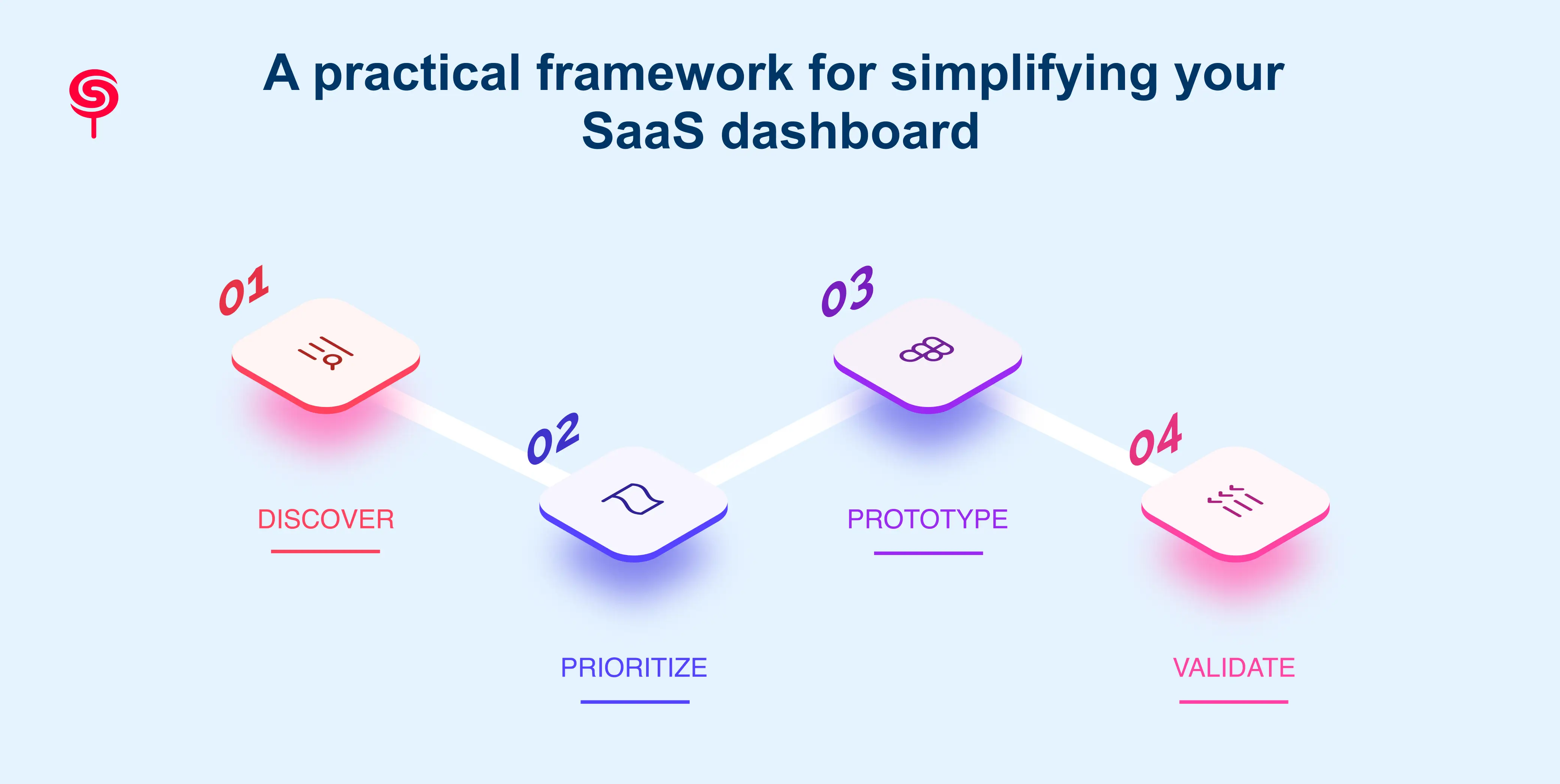
Introduce a simple, actionable 4-step framework CandyStudio uses during UX Audits and redesigns: Discover, Prioritize, Prototype, Validate.
Discover: user interviews, analytics audit, heatmaps, support ticket analysis to define primary user goals and pain points.
Prioritize: map features and metrics to user goals; remove or hide low-value items; create persona-specific views.
Prototype: low- to mid-fidelity layouts emphasizing information hierarchy and primary calls to action; rapid usability testing on critical tasks.
Validate: A/B test flows, measure activation/time-to-value, track task success and cohort retention, iterate.
For each step include expected deliverables (e.g., journey maps, prioritized backlog, clickable prototypes, success metrics) and sample timelines (2–8 weeks depending on scope).
Design patterns and micro-interactions that reduce confusion
Show practical patterns teams can implement: default goal-focused landing, progressive disclosure, contextual tooltips and modals, inline help & CTA, persistent quick-actions, guided checklists for onboarding, dynamic data grouping, and role-based filtering. Mention accessibility and responsive considerations so dashboards remain usable on varying screens. Each pattern links to short KPI benefits (activation, engagement, reduced support).
Business outcomes of better SaaS dashboard UX
Quantify outcomes and use concrete examples: improved activation rate, shorter time-to-first-value, lower churn, higher expansion MRR, lower support cost per account. Provide a sample ROI calculation or hypothetical scenario: e.g., a SaaS with 10,000 users improves activation by 15% and reduces churn by 2% estimated MRR lift and CAC payback improvement. Emphasize long-term benefits: improved product-market fit signals, higher NPS, more organic referrals.
When is it time to redesign your SaaS dashboard?
Provide decision signals and timelines: stagnating activation or engagement metrics after feature releases, recurring usability complaints, major product pivot, onboarding time > X days, sign-up-to-activation conversion below industry benchmarks, or when heatmaps show failure on core tasks. Provide a short checklist to decide between iterative fixes vs full redesign.
How a UX audit uncovers hidden dashboard problems
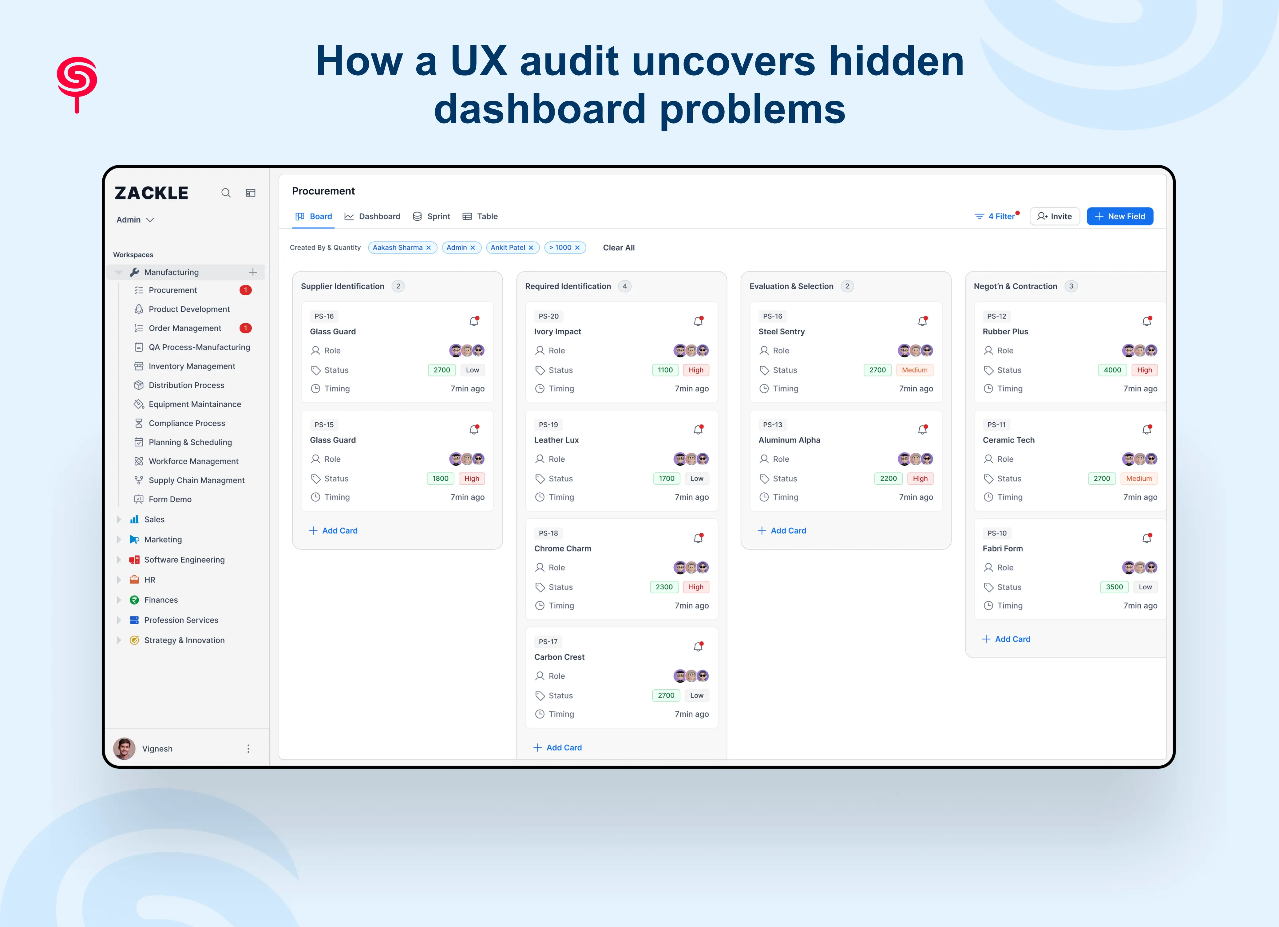
Explain what a professional UX audit includes and why it’s different from internal reviews: heuristic evaluation, analytics & funnel analysis, session replay sampling, qualitative interviews, tasks-based usability tests, accessibility review, and prioritized recommendations with estimated impact. Show the audit output (roadmap, quick wins, technical considerations) and explain how CandyStudio ties audit findings to growth metrics and product strategy. Include a short example of an audit uncovering a single fix that produced measurable improvement.
Why startups should invest in dashboard UX early
Argue benefits for early-stage products: faster time-to-value establishes habit formation, cleaner feedback loops to validate PMF, lower support overhead, easier onboarding for new segments, and defensibility via superior UX. Recommend minimum viable dashboard principles for early-stage teams (one clear goal per persona, analytics for that goal, and basic onboarding).
Conclusion
A confusing dashboard doesn't just frustrate users it directly impacts adoption, retention, customer satisfaction, and revenue growth.
The most successful SaaS companies don't win by adding more features. They win by helping users achieve outcomes faster and with less effort.
Investing in SaaS dashboard UX is no longer a design decision. It's a growth strategy.
If users struggle to navigate your product, a UX audit can uncover the friction points costing you customers and revenue.
Frequently Asked Questions
1. What makes a SaaS dashboard good UX?
A good SaaS dashboard UX prioritizes the user's primary goal above all else. It uses clear visual hierarchy, consistent navigation, progressive disclosure of complex data, and contextual metrics with benchmarks. The best dashboards are designed around user mental models not internal org structures and are validated through usability testing with real users.
2. What is a SaaS dashboard UX audit?
A SaaS dashboard UX audit is a structured diagnostic process that identifies usability failures, navigation breakdowns, cognitive overload issues, and design anti-patterns in your product dashboard. It combines analytics review, expert heuristic evaluation, user research, and competitive benchmarking to produce a prioritized roadmap of improvements mapped to business outcomes.
3. What are the most common SaaS dashboard design mistakes?
The most common mistakes are: displaying too much data at once (cognitive overload), having no clear primary action, inconsistent navigation patterns, metrics without context or benchmarks, neglected empty and error states, and designing without observing real user behavior. Most of these issues are invisible to teams who are too close to their own product.
4. How does dashboard UX affect SaaS retention and churn?
Dashboard UX is one of the primary drivers of early-stage SaaS churn. Users who can't navigate your dashboard don't reach the "aha moment," don't form usage habits, and don't renew. Studies consistently show that improving dashboard usability reduces first-90-day churn and increases long-term retention by helping users discover and adopt core features faster.
Share this blog!
Latest Blogs
Explore our latest insights on design, AI, and digital innovation.


