How UX Design Increases Direct Travel Bookings
Author
Vignesh
Published On

Every travel founder has seen the same dashboard nightmare: healthy traffic, decent ad spend, a product that works and a booking completion rate that refuses to move. Marketing fills the funnel. UX decides how much of it survives to checkout.
That gap between visitors and paying customers is rarely a pricing problem or a demand problem. It's a travel booking UX problem and it's quietly costing OTAs, hotel platforms, and travel SaaS companies millions in direct revenue every year, most of which is being handed straight to Booking.com, Expedia, and Google Hotel Ads.
This piece breaks down why travel businesses lose direct bookings, how UX design increases direct travel bookings in measurable ways, and what a high-converting booking experience actually looks like with a practical audit checklist you can run against your own product today.
Why Are Travel Businesses Losing Direct Bookings?
Most travel platforms don't lose bookings because travelers don't want to book direct. They lose bookings because the path to booking direct is harder than the path through an OTA.
The most common failure points show up in the same places, again and again:
Slow, cluttered search results that force users to compare dozens of similar options without clear differentiation.
Filters that don't match how people actually think travelers search by "beachfront, pet-friendly, under $150," not by internal database tags.
Booking flows with too many steps, each one an exit ramp for hesitant users.
Hidden fees revealed at checkout, which is one of the single biggest drivers of cart abandonment in travel.
Payment friction no local payment methods, no guest checkout, no saved cards.
Mobile experiences that feel like shrunk-down desktop sites, not designed for one-thumb booking on the go.
Low trust signals no reviews, no visible security badges, no clear cancellation policy.
Why UX Design Matters More Than Ever in the Travel Industry
Travel is a high-anxiety purchase category. Buyers are committing money, time off, and often family plans to a decision they can't physically inspect beforehand. That anxiety makes UX design a business-critical function, not a cosmetic one.
Three shifts have made this even more urgent:
OTAs have trained user expectations. Travelers now compare every independent booking site against the polish of Expedia or Airbnb. Anything less feels risky.
Mobile now dominates travel research and booking, which means a clunky mobile flow doesn't just lose some bookings it loses the majority.
Acquisition costs keep rising. When paid traffic is expensive, every percentage point lost to poor UX is a direct hit to marketing ROI and customer acquisition cost (CAC).
In this environment, a travel website UX audit isn't a nice-to-have design exercise. It's a direct revenue lever, sitting right next to paid media and SEO on the growth team's priority list.
How UX Design Increases Direct Travel Bookings
Good UX increases direct travel bookings by systematically removing the friction, confusion, and hesitation that push travelers back toward third-party aggregators. In practice, this happens through a few concrete mechanisms:
Faster, clearer search-to-results paths reduce bounce rate and keep users engaged long enough to see your inventory.
Progressive disclosure in booking flows showing only what's needed at each step lowers cognitive load and boosts booking completion rate.
Transparent pricing early in the journey prevents the checkout-stage abandonment caused by surprise fees.
Trust-building design patterns (reviews, verified badges, clear refund policies) reduce the psychological barrier to paying upfront.
Mobile-first booking flows capture the growing share of travelers who research and book entirely on their phones.
Personalization remembering search history, showing relevant destinations increases session duration and repeat visits, which compounds customer lifetime value (CLV).
How CandyStudio Helps You Convert More Visitors
This is exactly the gap CandyStudio works in. As a UX and product design partner for travel startups, OTAs, and hospitality platforms, CandyStudio runs structured UX audits, redesigns booking flows, and rebuilds checkout experiences around conversion not just aesthetics.
The engagement typically follows a simple arc: audit the current experience against booking behavior data, identify the highest-impact friction points, redesign and prototype the fix, then validate it with real users before a single line of production code changes. For product managers, CTOs, and growth leads who don't have in-house UX bandwidth, this turns "we think our booking flow is fine" into a validated, revenue-backed redesign roadmap.
Business Benefits of Investing in Travel Website UX
UX investment shows up on the P&L, not just the design system. Travel businesses that prioritize booking UX typically see improvement across:
Direct revenue less commission paid to OTAs on every booking.
Booking completion rate more visitors finishing what they started.
Customer acquisition cost (CAC) the same ad spend converts more efficiently.
Customer lifetime value (CLV) smoother experiences drive repeat direct bookings instead of repeat OTA searches.
Bounce rate and session duration stronger engagement signals that also improve SEO performance over time.
Brand trust a polished, frictionless product builds the kind of credibility that OTAs, by design, never let a travel brand build for itself.
For SaaS founders and travel platforms judged on retention metrics as much as acquisition, UX becomes the connective tissue between marketing performance and long-term unit economics.
UX Strategies Used by High-Converting Travel Platforms
Looking across the travel platforms that consistently outperform on direct bookings, a few patterns recur:
Search-first homepages that get users into results in one or two interactions, rather than burying search behind marketing content.
Visual, scannable results pages with clear differentiation (price, location, rating) instead of dense text blocks.
Short booking flows ideally three steps or fewer from selection to confirmation.
Real-time availability and pricing, so users never hit a "sorry, that's no longer available" wall after committing time to the flow.
Guest checkout by default, with account creation offered as an optional upgrade, not a gate.
Post-booking clarity instant confirmation, clear next steps, and easy access to modify or cancel.
Travel Website UX Audit Checklist
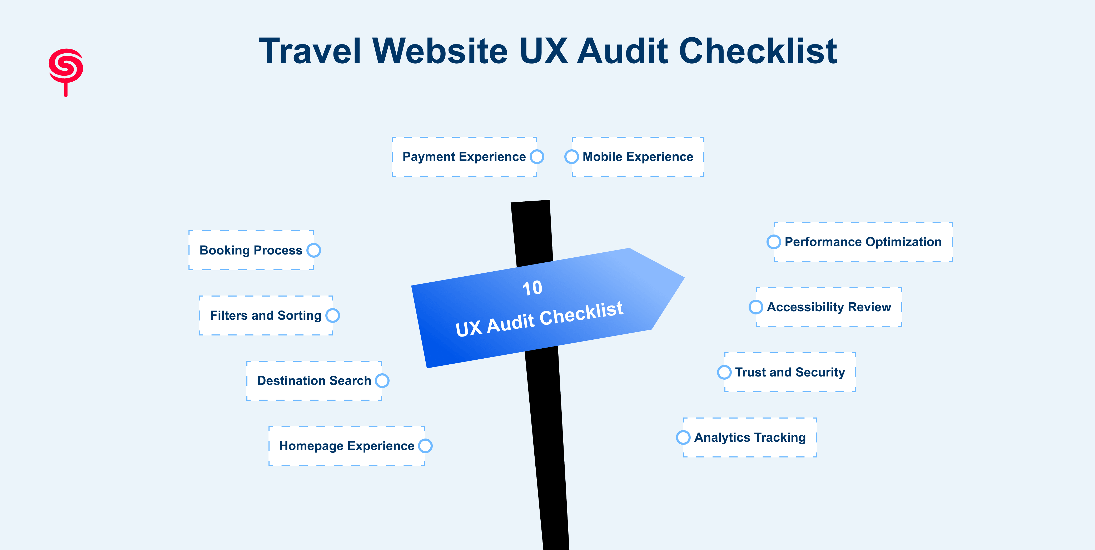
Use this as a working checklist for your own platform the same structure CandyStudio uses when scoping a UX audit for travel and hospitality clients.
Homepage Experience Is the primary action (search) immediately visible and usable without scrolling?
Destination Search Does search accept natural language and common misspellings, and return relevant results quickly?
Filters and Sorting Do filters reflect real traveler priorities (price, amenities, distance) rather than internal categorization?
Booking Process How many steps separate "select" from "confirmed"? Where do users drop off?
Payment Experience Are local payment methods, guest checkout, and saved-card options available?
Mobile Experience Is the mobile flow designed natively for touch and small screens, or shrunk from desktop?
Performance Optimization Do pages load fast enough to prevent bounce, especially on mobile networks?
Accessibility Review Can the site be used with screen readers, keyboard navigation, and sufficient color contrast?
Trust and Security Are reviews, security badges, and cancellation policies visible before payment, not after?
Analytics Tracking Is every step of the funnel instrumented well enough to see exactly where users abandon?
How Startups Can Improve Their Travel Website UX
For travel startups without a dedicated UX team, improvement doesn't require a full rebuild. It requires a disciplined, iterative process:
Conduct UX Research Talk to real users about their booking experience, not just what analytics tools report.
Analyze User Behavior Use session recordings and funnel analysis to see exactly where hesitation and drop-off occur.
Identify Friction Points Rank issues by impact on booking completion rate, not by how easy they are to fix.
Prioritize High-Impact Improvements Start with checkout and mobile flow before touching lower-impact pages.
Prototype and Test Validate changes with real users before committing engineering time to a full build.
Continuously Measure and Optimize Treat UX as an ongoing growth lever, with the same rigor applied to SEO or paid acquisition.
Conclusion
Direct bookings aren't won through pricing alone. They're won through experience through search that feels instant, booking flows that feel short, and checkout that feels safe. Every friction point in that journey is a small tax on revenue, quietly paid to whichever aggregator makes the experience easier.
For travel startups, OTAs, and hospitality platforms serious about growing direct revenue and reducing dependence on third-party channels, a structured UX audit is one of the highest-leverage investments available. It's not about making the product prettier. It's about making the path to "book now" shorter, clearer, and more trustworthy than anywhere else the traveler could go.
Frequently Asked Questions
1. Why is UX important for travel websites?
Travel is a high-anxiety, high-consideration purchase. Strong UX builds the trust and clarity needed to convert hesitant browsers into paying customers.
2. How can hotels increase direct bookings through UX?
By streamlining the booking engine, offering transparent pricing upfront, enabling guest checkout, and matching or beating the polish of major OTAs.
3. How does UX design increase direct travel bookings?
By removing friction across search, filtering, booking, and payment, UX design keeps more visitors moving through the funnel instead of abandoning to a competitor or an OTA.
4. How does mobile UX affect travel bookings?
Since a majority of travel research and booking now happens on mobile, a poor mobile experience directly caps how much of your traffic can convert.
Share this blog!
Latest Blogs
Explore our latest insights on design, AI, and digital innovation.