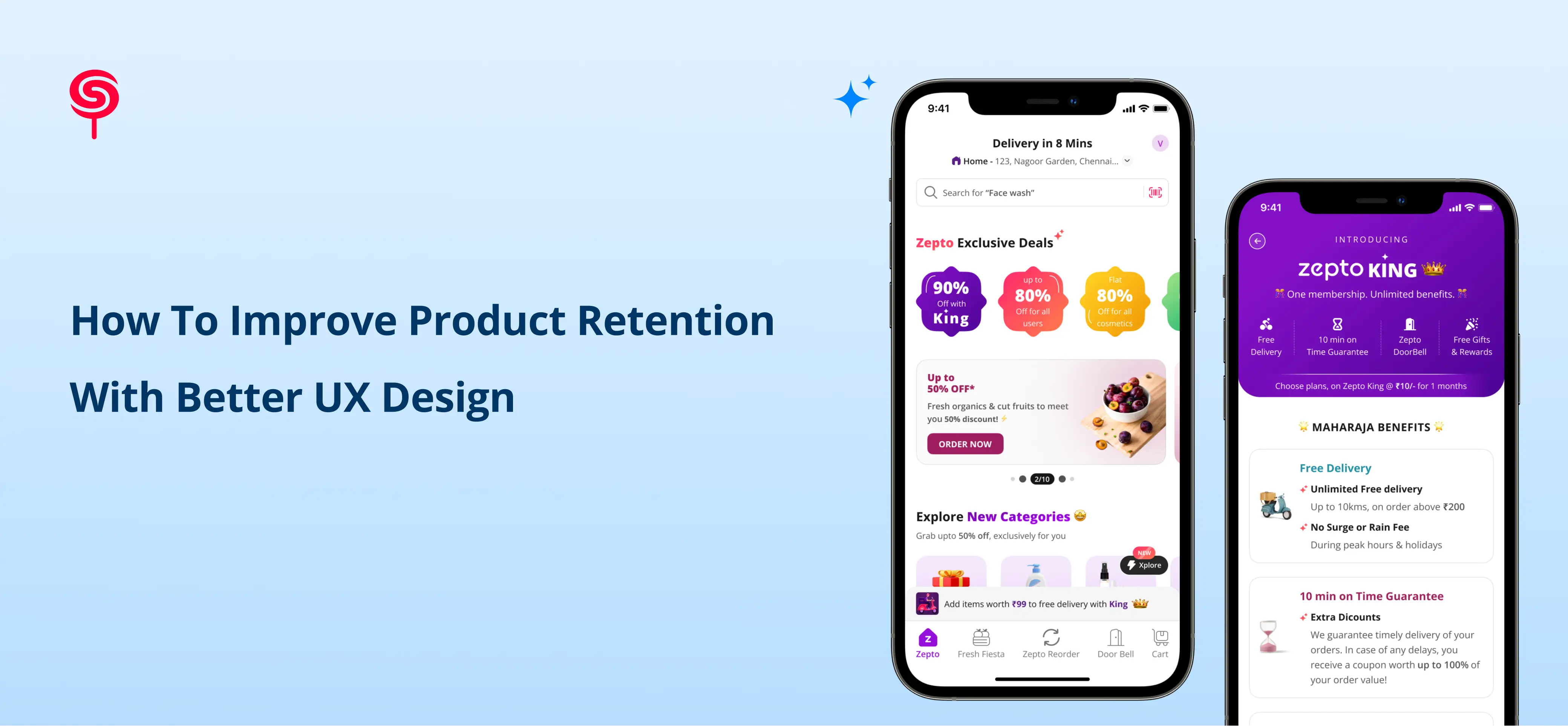
How to Improve Product Retention with Better UX Design
Author
Vignesh
Published On
Most startups don’t die because of acquisition problems. They die because users try the product, get confused, disengage, and never come back.
Under the hood, that’s a retention problem and in 9 out of 10 cases, it’s a UX problem.
You can pour money into paid campaigns, influencer partnerships, and outbound sales. But if your onboarding is leaky, your flows are unintuitive, and your product doesn’t feel “worth coming back to,” you’re scaling a hole in the bucket.
This article breaks down how to improve product retention with better UX design, backed by real-world startup scenarios, proven frameworks, and specific strategies you can implement now.
Why Poor UX Kills Retention
The challenge with UX-driven churn is that it rarely announces itself. Users don't send a Slack message saying 'I left because your information architecture was unclear.' They simply stop logging in. They choose silence over feedback. By the time churn shows up in your metrics, the design failures that caused it happened weeks earlier.
The Three Silent Killers of Product Retention
1. Onboarding Drop-Off: The most expensive design failure in SaaS. If users cannot reach their first 'aha moment' within their initial session, the probability of them returning drops precipitously. Industry data from Intercom shows that products with guided onboarding retain 2.4x more users through Day 14 than those without. Yet the majority of early-stage products treat onboarding as a feature, not a design discipline.
2. Cognitive Overload on Core Workflows: When a product attempts to surface too much functionality before users have developed fluency, it triggers decision paralysis. Users presented with complex dashboards before completing a single meaningful task don't explore the product; they abandon it. Nielsen's Law of information processing tells us that humans can hold seven (plus or minus two) pieces of information in working memory. Product UIs routinely violate this in their first screen.
3. Feedback Void and Error Handling: Users need to know the product is responding to them. When actions don't produce visible confirmation, when error messages are technical rather than instructive, and when the path to recovery from a mistake is unclear, users interpret the silence as unreliability. Trust erodes. Churn follows.
UX metrics that matter for retention
To tie UX design directly to business outcomes, anchor it in a simple metrics stack
The DAU/MAU Ratio: Your UX Health Metric:
Retention quality is best understood through the DAU/MAU (Daily Active Users / Monthly Active Users) ratio sometimes called the 'stickiness ratio.' A ratio above 20% is considered healthy for most SaaS products; above 40% indicates category-leading engagement. WhatsApp, at its peak growth phase, maintained a DAU/MAU above 70% a direct product of obsessive UX simplicity.
For most startups, DAU/MAU sits between 8–15%. Closing the gap to 25%+ is almost always a design and experience problem first, and a features problem second. Users don't become daily active because you added functionality. They become daily active because the product is frictionless, intuitive, and consistently valuable from the moment they open it.
UX frameworks that improve retention
Improving product retention through UX is not guesswork. There are established frameworks, grounded in behavioural psychology and product analytics, that systematically identify and resolve the design failures causing churn. Below are the four most impactful methodologies we apply when designing for retention.
Below are core frameworks we use with startups to drive retention. Start with an end-to-end journey map, focused on retention milestones, not just screens.
Key stages:
Awareness → Signup
User motivation is high but fragile; expectations are set by your landing page, ads, and sales pitch.First session → Activation
The mission here: compress TTV. Design a path that gets the user to their first “I’m glad I signed up” moment as fast as possible.Days 2–7 → Early engagement
Reinforce value, introduce depth in context (not all at once), and start building a habit loop.Weeks 2–4 → Ongoing usage
Help users integrate your product into their workflows, teams, and data ecosystem.
Months 2+ → Expansion and advocacyDrive feature expansion, cross-team adoption, and emotional lock-in (“we can’t imagine working without this”).
Framework 1: The Aha Moment Architecture
Every product has an 'aha moment' the specific instant when a new user first experiences the product's core value promise. Facebook's was the moment a user saw that seven or more friends had joined. Slack's was the moment a team sent 2,000 messages. Spotify's was a perfectly matched Discover Weekly playlist.
The UX design challenge is to architect a path from signup to aha moment that is ruthlessly direct. Every screen, every prompt, every empty state between the user and that moment of value realisation is a retention risk. We map this path by building instrumented onboarding flows and identifying the precise action that correlates most strongly with 90-day retention, then redesigning the entire first-run experience to accelerate toward it.
Framework 2: Progressive Disclosure Design
Progressive disclosure is the practice of presenting only the information and functionality a user needs for their current task, and revealing additional complexity as they develop product fluency. It's the antidote to feature-driven UI bloat a common failure mode in well-funded startups that have built too much product before validating what users actually use.
In practice, this means designing a default experience for the 80% use case, building contextual feature discovery into the workflow (rather than burying features in menus), and using empty states, tooltips, and progressive prompts to introduce advanced functionality at the right moment in the user journey.
Framework 3: Jobs-to-Be-Done (JTBD) Navigation Design
Clayton Christensen's Jobs-to-Be-Done framework reframes product design around the user's actual goal, not the feature set. Users don't hire your project management tool to 'manage tasks' they hire it to not miss a deadline, or to prove to their team that a project is on track. Navigation and information architecture designed around JTBD patterns eliminates the category error that causes most onboarding failure: designing for feature discoverability when users are navigating toward an outcome.
JTBD-informed IA restructures menus, labels, and navigation hierarchies around action verbs and user goals rather than product nouns. 'Start a new campaign' instead of 'Create.' 'Find last week's report' instead of 'Reports.' These are not copy changes. They are architectural decisions that reduce time-to-value and increase session depth.
How AI-Driven Design Capabilities Build Trust and Increase Startup Valuation
This is where modern product design becomes a strategic asset beyond the UX layer itself. Startups that demonstrate AI-augmented design capabilities not just AI-featured products, but AI-powered design processes are fundamentally repositioning themselves in the eyes of investors, enterprise clients, and the market.
Here’s how showcasing AI capability in your UX does two things: improves retention and boosts perceived valuation.
1. AI compresses time-to-value:
Examples:
Smart onboarding: An AI assistant that reads the user’s data (with consent) and auto-configures dashboards, segments, or workflows.
Personalized checklists: AI-generated “next best actions” tailored to a user’s industry, role, and current behavior.
Intelligent data cleanup: Automatic suggestions to fix missing or inconsistent data that block usage.
When users see real results in minutes not days your activation and week-1 retention improve significantly.
2. AI enhances relevance and stickiness
AI can drive hyper-personalized UX:
Recommendation panels: “Based on how your team works, here’s what to set up next.”
Adaptive interfaces: Surfaces commonly used actions, hides rarely used ones, and adjusts as behavior changes.
Smart notifications: Alerts triggered by meaningful patterns (anomalies, churn risk, opportunity spikes), not just time-based reminders.
This turns your product from a static tool into an active “co-pilot,” which users feel compelled to revisit.
3. AI as a trust and valuation signal
Sophisticated yet usable AI capabilities signal three powerful things to investors and enterprise buyers:
Technical competence: You’re not just bolting on AI; you’re integrating it deeply into the workflow with thoughtful UX.
Operational leverage: AI reduces customer support load, onboarding time, and complexity.
Defensibility: Data and AI-powered personalization deepen switching costs, making it harder for users to leave.
A well-designed AI experience clear explanations, transparent controls, obvious value shows that your team understands both the tech and the human side. That combination raises your perceived product maturity and can positively influence valuation conversations.
But this only works if the AI UX is:
Explainable: Show what the system did and why.
Controllable: Let users override or refine AI outputs.
Safe: Respect privacy, give clear consent flows, and avoid “black box” surprises.
From Better UX to Better Business: The Retention-Revenue Connection
The business case for design investment in retention is one of the most defensible ROI calculations in the product growth toolkit. The mathematics are straightforward: a 5% improvement in retention rate can increase company revenue by 25–95% over a five-year period (Bain & Company). The compounding effect of retaining customers who were previously churning transforms the unit economics of customer acquisition.
Improved UX → Lower Time-to-Value → Higher Activation Rate
When onboarding design reduces the time users take to reach their first meaningful success, activation rates climb. Higher activation directly improves 30-day and 90-day retention cohorts. This is the most upstream and highest-leverage design intervention available.
Higher Retention → Increased Feature Adoption → Expanded Revenue
Retained users discover more of the product's value surface over time. This natural feature adoption pathway increases the likelihood of plan upgrades, seat expansion, and referral generation. Product-led growth (PLG) models rely entirely on this mechanism and all PLG motion begins with a retention-optimised UX.
Better NPS → Organic Acquisition → Lower CAC at Scale
Net Promoter Score is a direct function of product experience quality. Products with NPS above 50 generate measurable word-of-mouth acquisition loops. For a capital-efficient startup, a NPS-driven acquisition channel bought with design investment rather than ad spend fundamentally changes the fundraising story.
Frequently Asked Questions
1. How quickly can UX design changes improve retention metrics?
Measurable improvements in activation rate (the first leading indicator of retention) are typically visible within two to four weeks of deploying redesigned onboarding flows. Full cohort retention improvements visible in 30-day and 90-day data generally manifest within six to twelve weeks, depending on your user acquisition velocity.
2. Which UX metrics should startups track to improve retention?
Focus on DAU/MAU for stickiness, activation rate for initial success, time-to-value for onboarding quality, week 1 and month 1 retention as leading indicators, and churn rate for long-term health. Layer in feature adoption metrics to understand which behaviors correlate with your best cohorts.
3. How can AI improve UX and retention?
AI can personalize onboarding, reduce setup friction, recommend next best actions, and surface timely insights. This compresses time-to-value and keeps the experience relevant, which encourages repeated usage. Well-designed AI UX also signals technical maturity and can increase perceived product value.
4. What is the difference between UX design and product design for retention purposes?
For retention, the distinction matters less than the integration. UX design (user experience) focuses on the quality and intuitiveness of interactions; product design encompasses the broader system of decisions about what to build, for whom, and how it evolves. The most effective retention-improvement engagements address both: they improve the moment-to-moment experience while also ensuring that the product's feature set and roadmap are aligned with actual user jobs-to-be-done.
Share this blog!
Latest Blogs
Explore our latest insights on design, AI, and digital innovation.


