How Better UX Increases Course Completion Rates
Author
Vignesh
Published On

Course completion rates are one of the clearest signals that an education product is delivering value. Yet many learning platforms struggle: industry averages for self-paced online courses often sit below 15–30% completion, while cohorts in subscription-based and microlearning products vary widely. For founders and product teams, low completion is more than a vanity metric it erodes lifetime value, increases churn, and masks product-market mismatch. In this article I’ll explain the hidden costs of low completion, why learners drop off, and the UX strategies that reliably lift engagement and completion rates. If you manage an EdTech product or learning platform, these are the tactical changes that turn more signups into certificates, renewals, and advocates.
The Hidden Cost of Low Course Completion Rates
Low completion rates don’t just mean unhappy learners they hit your top-line and unit economics directly. Imagine 1,000 enrollments with a 20% completion rate versus a 30% completion rate: the incremental 100 completers may translate into higher certification purchases, stronger referrals, and better retention. That change compounds across cohorts and quarters, improving ARPU and reducing CAC payback time. Beyond direct revenue, incomplete courses generate operational friction: more support tickets from confused learners, more time spent revising poorly performing content, and wasted marketing spend on audiences that never realize value. Investors and partners also notice a product with thin completion metrics looks harder to scale and monetize. In short, completion is a business metric as much as a learning outcome.
Why Students Abandon Online Courses
Learner dropout is multi-causal, and many causes intersect with UX. Typical reasons include:
Motivation decay: initial enthusiasm fades when learners don’t see quick wins or clear progress.
Cognitive overload: dense, unchunked content and unclear instructions lead to confusion and avoidance.
Onboarding friction: a confusing signup, undefined learning path, or delayed first-win causes early churn.
Navigation and flow issues: learners get lost between lessons, can’t find the next step, or struggle with inconsistent UI patterns.
Weak feedback loops: delayed or non-actionable assessment feedback leaves learners unsure how to improve.
Technical and accessibility barriers: slow load times, poor mobile support, or inaccessible content exclude learners.
Misaligned expectations: marketing promises don’t match course structure or time commitment.
Understanding where learners drop off is the first step to fixing it. Common drop-off moments are the first week (when expectations meet reality), the first assessment (when feedback is poor), and the payment/upgrade moment (when perceived value doesn’t match cost).
How UX Directly Influences Learning Behavior
UX is the bridge between pedagogy and product behavior. Thoughtful UX reduces friction, scaffolds motivation, and shapes habit formation. Several mechanisms matter:
Microlearning and chunking: UX that structures content into bite-sized lessons reduces cognitive load and increases completion by making progress feel attainable.
Progress signaling: clear visual indicators (progress bars, module states) trigger goal pursuit and momentum.
Immediate feedback: well-designed assessments with actionable feedback create learning loops that keep users engaged.
Personalization: adaptive paths and recommended next steps reduce decision fatigue and keep learners on a path tailored to their level.
Habit triggers: notifications, scheduled nudges, and calendar integrations create cues that drive repeat usage.
From a measurement perspective, UX changes influence metrics like activation rate (first week return), module completion rate, time-to-first-return, and ultimately certificate completion and retention.
UX Strategies That Increase Course Completion Rates
Below are evidence-informed, practical UX interventions that reliably move the needle.
Fix the onboarding and first-lesson experience
Onboarding must deliver a meaningful first win. Start by setting clear expectations: show estimated time-to-complete for lessons, outline outcomes, and personalize the first lesson based on a short diagnostic or learner goal. Use a crisp orientation that reduces setup steps and delivers immediate, low-effort tasks that learners can finish within 5–10 minutes.
Design clear progress architecture
Visual progress signals reduce ambiguity. Use module-level completion states, inline progress bars, and “next suggested action” CTAs. Break courses into micro-units and show completion percentages at multiple levels (lesson, module, course) so learners constantly perceive forward motion.
Reduce friction in the learning flow
Streamline navigation, keep consistent UI patterns, and remove unnecessary clicks between lessons and activities. Use persistent player controls, predictable placement of next buttons, and smart defaults (e.g., resume where you left off). For subscription or freemium models, minimize gating that interrupts the learning flow without a compelling reason.
Add motivational scaffolding
Apply behavioral design: micro-milestones, streaks, badges, and shareable certificates when they align with value. Focus on meaningful rewards (LinkedIn badges, certified credentials) rather than shallow gamification. Social features cohort chats, peer accountability groups, and leaderboards for certain professional courses can also boost completion for motivated learners.
Make assessment and feedback actionable
Replace end-of-module multiple-choice dumps with formative quizzes that identify misconceptions and point learners to specific remediations. Provide instant, short feedback and a clear “recommended next step” after each assessment. When possible, show progress improvement over time (e.g., skill mastery graphs) so learners see growth.
Personalize pacing and paths
Allow learners to accelerate, slow down, or take branching paths based on performance and goals. Personalized recommendations driven by simple heuristics (past completion, quiz scores, stated goals) help learners avoid decision paralysis and remain engaged.
Prioritize mobile-first and offline experiences
A large share of learners access content on mobile. Optimize for low-bandwidth scenarios, enable lesson downloads, and keep interfaces simple on small screens. Mobile UX that respects intermittent connectivity increases the window of opportunity for repeated practice.
Ensure accessibility and inclusive design
Make sure content follows WCAG 2.1 basics readable typography, captioned videos, keyboard navigation, and clear semantic structure. Inclusive design increases completion by broadening the base of learners who can engage successfully.
Measure, test, iterate
Instrument the learning funnel (lesson started, lesson completed, quiz attempted, quiz passed, returned within 7 days). Use cohort analysis and A/B tests to validate assumptions (e.g., onboarding A vs B, progress bar vs no progress bar). Prioritize experiments with clear success metrics tied to completion.
Why Startups Should Invest in Regular UX Audits
A focused UX audit is a high-leverage investment. Compared to full redesigns, audits identify high-impact fixes that can be piloted quickly. Audit benefits include:
Diagnosing behavioral bottlenecks in the learning funnel.
Revealing misalignments between course objectives and UI flows.
Prioritizing fixes with the best ROI (quick wins that reduce early dropoff).
Uncovering technical and accessibility issues that silently block learners.
Startups should audit when they see plateauing retention, rising CAC, low NPS, or inconsistent course performance across cohorts. Regular audits (every 6–12 months) keep optimization efforts aligned with new features and content.
How a UX Audit Process Improves Completion Rates
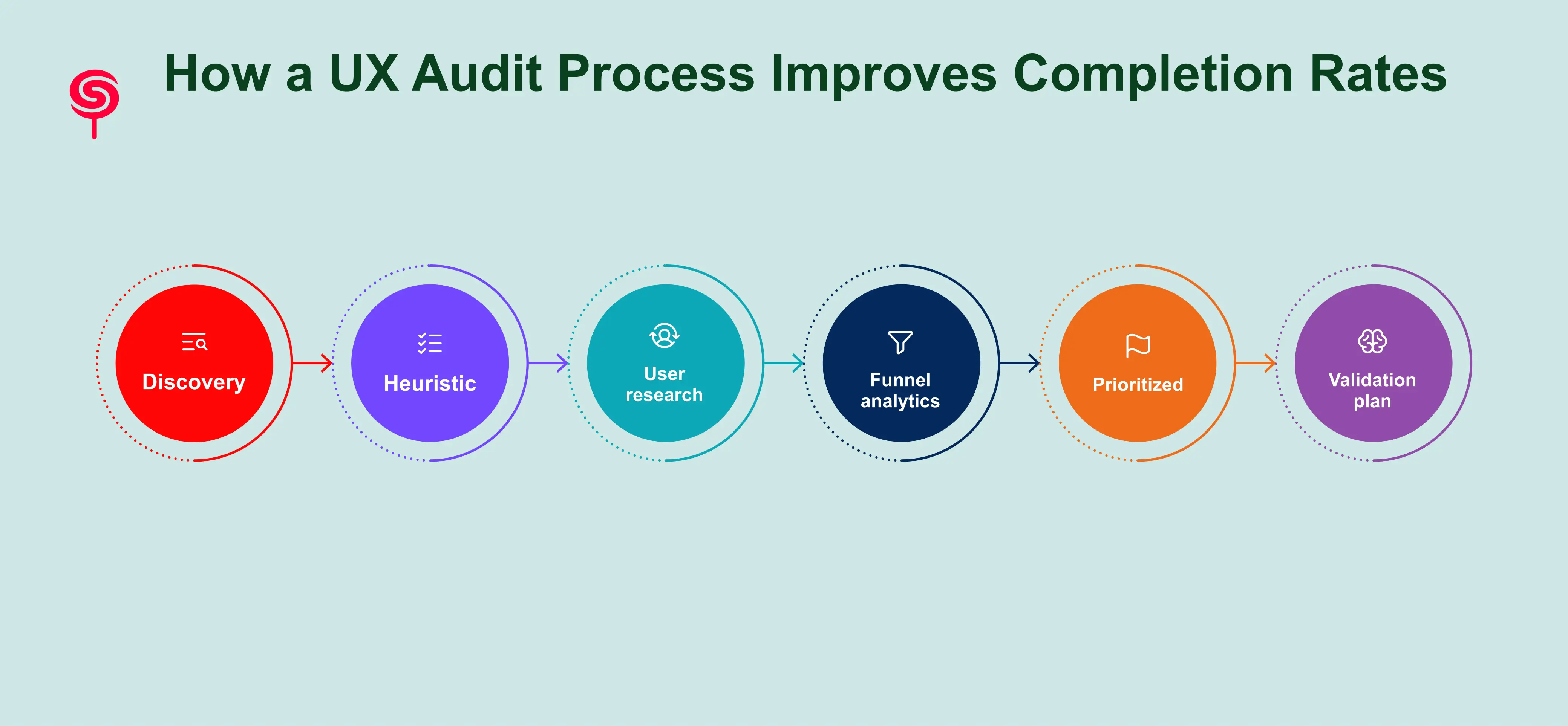
An effective UX audit for learning platforms combines product analytics, usability research, and learning-design heuristics. Core phases are:
Discovery: Review analytics, product goals, SLA with stakeholders, and learner personas.
Heuristic and pedagogy review: Evaluate UX heuristics alongside instructional design principles chunking, feedback cadence, alignment with learning objectives.
User research: Run targeted usability tests with representative learners, record task-based observations, and interview dropouts to surface friction points.
Funnel and analytics mapping: Map events and cohorts to locate the largest drop-off points and quantify potential impact.
Prioritized remediation roadmap: Rank issues by impact, effort, and confidence. Create a sprint-friendly backlog with quick wins and strategic experiments.
Validation plan: Define A/B tests, success metrics, and post-implementation monitoring.
Deliverables typically include an audit report, prioritized backlog, recommended quick wins, clickable prototypes for critical flows, and an experimentation roadmap. A focused audit for a mid-stage product often runs 2–6 weeks depending on scope.
Business Outcomes and Growth Metrics
Improving completion rates delivers measurable business value. Sample impacts include:
Higher lifetime value: learners who complete are more likely to purchase advanced courses, renew subscriptions, and refer peers.
Lower churn: perceived and realized value reduces cancellation rates, improving retention curves.
Better unit economics: improved completion increases payback on CAC by turning more trial users into paying, retained customers.
Faster product-market fit: strong completion metrics strengthen investor conversations and partnership opportunities.
To sell UX work internally, build a simple ROI model: estimate the expected completion uplift from UX changes, multiply by ARPU and retention improvements, then compare against audit and implementation costs to compute payback period. Even modest improvements (e.g., +10% relative completion increase) can pay for several months of product development.
Conclusion
Course completion is both a learning outcome and a business lever. Better UX reduces friction, scaffolds motivation, and aligns product behavior with proven learning science resulting in higher completion rates, improved retention, and stronger revenue outcomes. For EdTech founders and product leaders, the fastest path to measurable improvement is a focused UX audit that identifies high-impact fixes, validates them through experiments, and embeds continuous measurement into the product lifecycle.
If you’d like, we offer a free 30-minute UX audit scoping call and a downloadable Course Completion Optimization Checklist that outlines the quick wins and prioritization framework referenced here. Book a scoping call to get a free micro-audit and a prioritized 2-week action plan tailored to your learning platform.
Frequently Asked Questions
1. How does UX affect course completion rates?
UX influences learner motivation, navigation efficiency, cognitive load, and engagement. Better UX reduces friction and helps learners progress through courses more successfully.
2. Why do students abandon online courses?
Common reasons include poor navigation, unclear learning paths, weak onboarding, lack of progress visibility, mobile usability issues, and overwhelming course structures.
3. Will UX changes disrupt current users?
Thoughtful rollouts use staged releases and feature flags, pilot groups, and A/B testing to reduce disruption. Many fixes (e.g., progress indicators, micro-feedback) are additive and can be rolled out without major churn.
4. Can small startups afford UX audits?
Yes. Micro-audits focused on the onboarding funnel and first-week experience are low-cost and high-impact. Pilot engagements can validate ROI before larger investments.
Share this blog!
Latest Blogs
Explore our latest insights on design, AI, and digital innovation.


