When Should You Redesign Your Education Product?
Author
Vignesh
Published On
Education products LMSs, course platforms, and learning apps are mission-critical for learners, instructors, and institutions. But even the best learning tools age: engagement drops, metrics slip, support tickets multiply, and the product stops delivering learning outcomes. Redesigning an education product at the right time turns friction into flow, boosts learner retention, and protects lifetime revenue for SaaS companies. This post explains when to redesign your education product, outlines 12 warning signs, shows a practical UX-led redesign framework, and maps out how CandyStudio helps EdTech teams convert UX improvements into measurable growth.
What Is Product Redesign?
A product redesign is a deliberate, research-backed overhaul of how users experience your platform not just a visual refresh. It touches information architecture, onboarding flows, navigation logic, accessibility, and the underlying design system that holds your product together as it scales.
This is different from a UI facelift. A UI facelift changes colors, fonts, and icons. A true redesign changes how a learner moves from "I signed up" to "I finished the course and came back for another one." For education platforms specifically, that distinction matters enormously, because learning products carry a unique burden: users must stay motivated across multiple sessions, sometimes weeks apart, without a human teacher physically present to re-engage them.
Why Do We Need to Redesign an Education Product?
Education products decay differently than typical SaaS tools. A project management tool can survive clunky UX because the user has no alternative but to push through it for work. A learning platform cannot. The moment friction appears a confusing dashboard, a broken video player, an onboarding flow that buries the "start learning" button the learner simply leaves and doesn't come back. There's no manager forcing them to stay logged in.
Redesign becomes necessary when:
The product was built for an MVP audience of hundreds, and now serves tens of thousands with wildly different needs.
Feature requests have been bolted on reactively, without a cohesive information architecture.
Learner behavior has shifted (more mobile usage, shorter attention spans, higher expectations set by consumer apps like Duolingo or Notion).
Investors or enterprise buyers are asking harder questions about retention and completion metrics during due diligence.
When Should You Redesign an Education Product?
There's no universal calendar date for a redesign no "every 18 months" rule that applies to every LMS or course platform. Instead, redesign timing should be triggered by data, not by aesthetic boredom with your own product. The right time is when user behavior, business metrics, and competitive pressure all start pointing in the same direction: something in the experience is actively costing you learners and revenue.
12 Warning Signs Your Education Product Needs a Redesign
1. Student Drop-Off During Onboarding
If a meaningful percentage of new users never complete their first lesson, module, or profile setup, your onboarding is the leak. Onboarding is the single highest-leverage moment in any learning product it's where motivation is highest and patience is lowest.
2. Course Completion Rates Continue to Decline
Completion rate is arguably the most important north-star metric for any education product. A steady downward trend even a slow one signals that friction is compounding somewhere in the learner journey.
3. Your Interface Looks Outdated
Learners, especially younger and professional audiences, unconsciously equate visual quality with content quality. An interface that looks like it was built five years ago quietly undermines trust in your curriculum, no matter how strong the content actually is.
4. Mobile Experience Is Poor
A large share of learning now happens on phones, during commutes, breaks, or downtime. If your mobile experience is an afterthought slow, cramped, or missing core features you're losing an entire category of learning moments.
5. Users Struggle to Find Important Features
When support documentation or in-app tooltips have to compensate for confusing navigation, that's a structural UX problem, not a content problem.
6. Customer Support Requests Keep Increasing
A rising volume of "how do I..." tickets is one of the clearest quantitative signals that your interface isn't self-explanatory anymore.
7. Engagement Metrics Are Falling
Session frequency, time-on-platform, and returning-learner rates are early indicators that usually decline months before churn shows up in your revenue numbers.
8. Competitors Offer Better Learning Experiences
When prospects compare your product to a newer, sleeker competitor during sales calls, and design becomes an objection, that's a market signal you can't out-discount your way around.
9. Accessibility Standards Are Not Met
Beyond compliance risk, poor accessibility (contrast issues, missing alt text, keyboard-navigation gaps) directly excludes learners and shrinks your addressable market.
10. New Features Create More Complexity
If each new feature increases cognitive load or UI chaos, instead of adding value, you need a redesign to simplify flows and unify interactions.
11. Your Design System Is Inconsistent
Buttons that look different across screens, inconsistent spacing, and mismatched patterns all signal a product that grew without a unifying design foundation costing your engineering team velocity as much as it costs learners clarity.
12. Business Growth Has Stalled Despite Marketing Investment
This is the boardroom-level version of every signal above. When acquisition spend goes up but activation, retention, and expansion revenue stay flat, the product experience is quietly capping your growth ceiling.
Why Education Startups Delay Product Redesign
Most founders don't ignore these signs out of negligence they delay redesign because of very real, very rational fears:
Fear of disrupting existing users. "What if our loyal learners hate the change?"
Uncertainty about ROI. Redesign is often seen as a cost center, not a growth investment.
Resource constraints. Engineering roadmaps are already full of feature requests from sales and customer success.
Not knowing where to start. Without a structured framework, redesign feels like an open-ended, risky project rather than a controlled process.
These are legitimate concerns which is exactly why redesign should never start with a full rebuild. It should start with evidence.
How UX Directly Improves Education Product Performance
UX isn't a cosmetic layer sitting on top of your product it's the mechanism that translates your curriculum's value into measurable business outcomes. Strong UX shortens time-to-first-value, which directly lifts onboarding completion. Clear navigation reduces cognitive load, which increases session length and course completion. A consistent design system reduces engineering rework, which speeds up how fast new features ship. Accessible, mobile-first design expands your addressable learner base without a single dollar of additional ad spend.
A UX-Led Framework for Redesigning an Education Product
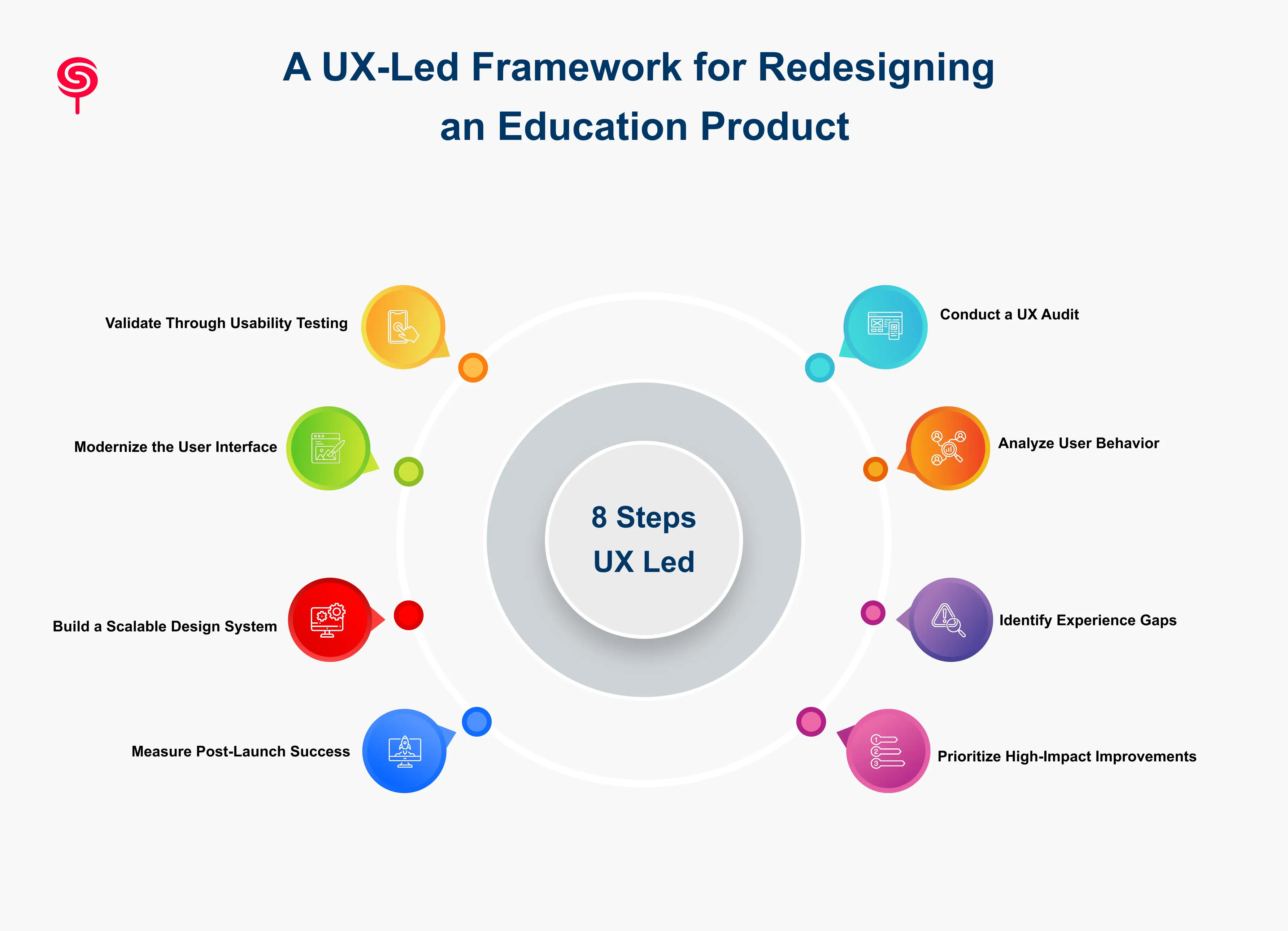
Step 1: Conduct a UX Audit
Every credible redesign begins with a structured UX audit a systematic evaluation of usability, accessibility, information architecture, and friction points across the entire learner journey. This is the foundation everything else is built on, and it's the fastest way to replace guesswork with evidence.
Step 2: Analyze User Behavior
Session recordings, funnel analytics, and heatmaps reveal where learners hesitate, backtrack, or abandon a flow entirely turning abstract complaints into concrete, prioritized problems.
Step 3: Identify Experience Gaps
Cross-reference behavioral data with direct learner feedback (support tickets, NPS comments, sales-call objections) to map exactly where expectations and reality diverge.
Step 4: Prioritize High-Impact Improvements
Not every fix deserves equal engineering time. Rank issues by a combination of business impact and implementation effort so the redesign delivers value in weeks, not just at a distant final launch.
Step 5: Modernize the User Interface
With validated direction in hand, refresh visual design, interaction patterns, and mobile responsiveness to meet current learner expectations.
Step 6: Build a Scalable Design System
A documented, reusable design system ensures every future feature ships faster and stays visually and functionally consistent directly solving the complexity problem.
Step 7: Validate Through Usability Testing
Prototype the highest-priority changes and test them with real learners before committing full engineering resources reducing the risk of building the wrong solution well.
Step 8: Measure Post-Launch Success
Track onboarding completion, course completion, engagement, and support ticket volume against pre-redesign baselines to prove ROI in hard numbers, not opinions.
How CandyStudio Helps Education Startups Redesign Products That Scale
CandyStudio works as an embedded UX and product design partner for EdTech founders, LMS builders, and learning-platform teams who need more than a visual refresh they need a strategic, research-driven redesign that protects existing users while unlocking new growth.
Our approach starts with a comprehensive UX Audit, mapping every friction point across onboarding, navigation, and course delivery. From there, we move into product strategy and discovery, prioritizing the changes that move business metrics fastest, followed by UI modernization and a durable design system that keeps your engineering team shipping quickly for years, not just for one launch cycle.
We've worked alongside founders navigating the exact signals covered in this guide declining completion rates, cluttered dashboards, mobile experiences that couldn't keep pace with growth and turned them into structured, validated redesign roadmaps.
If any of the 12 warning signs above sounded familiar, the next right step isn't a full rebuild. It's a UX Audit a low-risk, high-clarity way to see exactly where your product is leaking learners, and exactly what to fix first.
Business Outcomes and Growth Strategy
A well-executed redesign, grounded in real user data rather than internal opinion, typically shows up in three places: higher onboarding-to-activation conversion, improved course completion and retention, and reduced support burden as the interface becomes self-explanatory. Together, these translate into a more efficient growth engine one where your existing marketing spend converts into paying, retained learners at a meaningfully higher rate.
Conclusion
Redesigning an education product is not a cosmetic choice it’s a strategic investment in learning outcomes, retention, and growth. Look for concrete signals: onboarding drop-offs, falling course completion, mobile underperformance, and rising support volume. Use a UX-led, data-first approach: audit, validate, prioritize, modernize, and measure. For founders and product leaders unsure where to start, a focused UX audit uncovers the highest-value fixes and serves as the safest path to purposeful redesign. CandyStudio specializes in those audits and end-to-end redesigns turning UX problems into growth engines for EdTech products.
Frequently Asked Questions
1. What is an education product redesign?
An education product redesign is the process of improving the user experience, interface, workflows, and overall usability of a digital learning platform to enhance learner satisfaction, engagement, accessibility, and business performance.
2. When should you redesign an education platform?
You should consider redesigning when user metrics such as onboarding completion, learner retention, course completion, engagement, customer satisfaction, or conversion rates consistently decline despite ongoing feature development or marketing efforts.
3. What are the signs that an LMS needs a redesign?
Common indicators include declining course completion rates, increasing customer support requests, poor mobile usability, confusing navigation, outdated interfaces, accessibility issues, inconsistent design patterns, and slowing business growth.
4. What metrics indicate that a redesign is needed?
Key indicators include lower onboarding completion, declining learner retention, reduced course completion, poor feature adoption, increasing churn, falling Net Promoter Score (NPS), higher support volumes, and lower conversion rates.
5. How do you measure redesign success?
Success should be measured using business and product metrics such as learner activation, retention, engagement, feature adoption, course completion, customer satisfaction, support ticket reduction, and revenue growth.
Share this blog!
Latest Blogs
Explore our latest insights on design, AI, and digital innovation.