Why Your Education Platform Needs a UX Audit Before Scaling
Author
Vignesh
Published On

You've validated your idea. Enrollment numbers are climbing. Investors are paying attention. Every signal says it's time to scale.
So you hire. You expand server capacity. You push marketing spend. You open new cohorts.
Then something unexpected happens: churn accelerates. Support tickets pile up. Learners stop completing courses. Your cost-per-acquisition climbs while lifetime value quietly erodes.
This isn't a product-market fit problem. It isn't a content problem. In most cases, it's a learning platform UX problem and it was there long before you decided to scale.
The hard truth? Scaling a broken user experience doesn't fix it. It amplifies every crack in the foundation. What might have been a manageable friction point for 500 users becomes a retention catastrophe for 50,000.
The Reality of Scaling an Education Platform
Scaling an EdTech product is fundamentally different from scaling a SaaS tool or a marketplace. Why? Because your user's success is your product.
When someone uses project management software, a bad UX makes them frustrated. When someone uses a learning platform with a bad UX, they don't just leave they leave feeling like they failed. That emotional weight drives churn faster than almost any other category.
EdTech platforms carry a unique design burden:
Cognitive load management: Learning itself is mentally demanding. A confusing UI compounds that strain.
Progress visibility: Learners need constant reinforcement that they're moving forward.
Multi-device continuity: Students switch between desktop, tablet, and mobile constantly. Broken handoffs break momentum.
Motivational architecture: Unlike transactional software, engagement must be sustained over weeks or months.
Most founders build their MVP around feature delivery course content, quizzes, certificates, payment integration. UX is treated as a layer that gets "cleaned up later." But later never comes. Instead, technical debt accumulates alongside UX debt, and by the time you're ready to scale, the cost of fixing both is ten times higher than it would have been at the beginning.
A learning management system UX audit surfaces these issues before they compound at scale.
The Hidden UX Problems That Slow Down Platform Growth
The most dangerous UX problems aren't the ones users complain about. They're the ones users silently give up on.
Here are the hidden patterns that quietly kill EdTech platforms:
Onboarding Drop-Off You're Not Measuring
Most platforms measure enrollment numbers. Far fewer measure where in the onboarding flow new users abandon. A learner who signs up and never completes setup is counted as an "acquired user" but they're actually a lost one.
Common culprits mandatory profile setup before accessing any content, unclear next steps after registration, no contextual guidance for first-time users.
Unclear Learning Pathways
When a student logs in and doesn't immediately know what to do next, they close the tab. A disorganized course library, poor content hierarchy, or absent progress indicators all create what UX practitioners call "navigation paralysis." In educational platform UX, this is one of the most common and most fixable failure modes.
Assessment UX That Demotivates Rather Than Reinforces
Quizzes and assessments that don't provide immediate, clear feedback undermine the learner's sense of progress. Poor form design, ambiguous question wording, and clunky submission flows don't just irritate they erode confidence and motivation.
Mobile Experiences That Were Never Designed, Only Ported
Responsive design is not mobile UX design. A course video that plays beautifully on desktop but renders incorrectly on a 375px mobile screen loses the learner the moment they switch devices. For platforms targeting working professionals or emerging market students, mobile is the primary context not a secondary one.
Inaccessible Content Structures
Accessibility in EdTech product design is not optional it's both ethical and commercial. Platforms that fail WCAG 2.1 AA compliance exclude a significant portion of potential learners and create legal exposure as they scale into regulated markets.
Why Most Founders Miss UX Problems Until It's Too Late
If these problems are so impactful, why do smart founders miss them?
Because founders use their product differently than learners do.
You built it. You know exactly where everything is. You have the context, the mental model, and the motivation that a brand-new user doesn't. This is called the curse of knowledge and it's the most common reason UX problems go undetected at the leadership level.
Beyond that:
Qualitative signals get drowned out by quantitative wins. When enrollment is growing, individual complaints about confusing navigation feel like noise. They're not.
Your support team absorbs the friction. Users who struggle often email support before they churn. But support resolves the ticket not the root cause.
Analytics don't show what users intended to do. Heatmaps and session recordings show behavior. They don't explain why a user spent four minutes on a module landing page and then left. A UX audit connects behavior to intent.
Competitive pressure prioritizes features over experience. When a competitor ships a new feature, the instinct is to ship a comparable one not to make the existing experience smoother.
By the time the churn metrics become undeniable, the platform is already carrying thousands of users through a broken experience. Retrofitting UX at scale is expensive, risky, and disruptive to existing users.
What Is a UX Audit for an Education Platform?
A UX audit for an EdTech platform is a systematic, expert-led evaluation of your product's user experience against established usability principles, your specific learner personas, and your platform's business objectives.
It is not a redesign. It is not a survey. It is a diagnostic.
A comprehensive LMS UX audit typically covers:
Heuristic evaluation Expert review against Nielsen's 10 usability heuristics, adapted for learning environments
User journey mapping End-to-end analysis of key flows: onboarding, course discovery, learning progression, assessment, and certification
Accessibility review WCAG 2.1 AA compliance check across all core workflows
Analytics interpretation Correlating behavioral data (drop-off points, session depth, return rates) with identified UX friction
Competitive benchmarking How does your platform's experience compare to category leaders?
Prioritized recommendations Not a list of everything that's wrong, but a ranked roadmap of what to fix first for maximum impact
The output is a strategic document: a clear picture of where your platform is losing users, why, and what to do about it in order of business impact.
Critical User Journeys Every Education Platform Should Audit
Not all UX problems are equal. Some exist on pages users rarely visit. Others exist on the exact paths that determine whether a user completes their first course or churns in week two.
Here are the journeys that matter most for learning platform optimization:
First-Session Onboarding (0–10 Minutes)
The window between sign-up and first meaningful learning interaction. This is where the platform either earns or loses long-term engagement. Audit for: time-to-first-value, friction in registration, clarity of the recommended starting point.
Course Discovery and Enrollment
Can users find what they're looking for? Can they evaluate course relevance before committing? Audit for search functionality, filter logic, course preview quality, and enrollment confirmation flows.
In-Course Learning Progression
The moment-to-moment experience of working through a lesson. Audit for content navigation, media playback reliability, note-taking integration, progress indicators, and micro-interaction feedback.
Assessment and Feedback Loops
How learners experience quizzes, assignments, and feedback. Audit for question clarity, result communication, retry flows, and motivational framing of failure states.
Completion and Certification
The payoff moment often underdesigned. Audit for completion confirmation UX, certificate accessibility and shareability, and post-completion recommendations.
Re-engagement and Return Sessions
How effectively does the platform pull lapsed users back? Audit for progress resumption, notification relevance, dashboard clarity for returning users.
Signs Your Education Platform Needs a UX Audit
Not sure if the timing is right? Here are the signals that a learning platform UX audit is overdue:
Course completion rates are below 30%: Industry benchmarks vary, but persistent low completion is almost always a UX and engagement signal, not a content signal.
Trial-to-paid conversion is stagnating: If users try and leave, the free experience isn't demonstrating enough value. That's a UX problem.
Support volume is disproportionately high: When users regularly need help to complete basic actions, the interface is failing them.
Mobile session depth is significantly lower than desktop: Users are abandoning on mobile not because they don't want to learn, but because the experience doesn't support it.
You're planning a major feature release or funding round: Both are the worst times to discover foundational UX issues. Audit first.
You're entering new markets or demographics: A UX pattern that works for one user segment may actively alienate another. Expansion requires validation.
Churn is highest in the first 30 days: Early churn almost always traces back to onboarding and first-session experience.
How UX Audits Improve Student Engagement and Learning Outcomes
There's a dimension of educational platform UX that goes beyond business metrics: it directly affects whether learners actually learn.
Cognitive load theory tells us that irrelevant complexity in a learning environment actively impairs information retention. When a student is fighting the interface hunting for the next lesson, confused by a quiz submission, unsure if their progress was saved they are consuming mental resources that should be allocated to the learning material itself.
A well-designed learning environment:
Reduces extraneous cognitive load Intuitive navigation means learners can focus on content, not the container.
Reinforces self-efficacy Clear progress visibility and positive feedback loops build the learner's belief in their own capability.
Supports spaced repetition Smart UX design can surface review prompts, revisit opportunities, and streak mechanics that reinforce retention.
Decreases anxiety Especially for adult learners returning to education, a clear and forgiving interface reduces the performance anxiety that causes abandonment.
When your platform's UX is working, learners complete more. They share more. They upgrade, refer, and return. The design isn't just aesthetic it's the mechanism through which your content delivers its value.
The Business Impact of Conducting a UX Audit Before Scaling
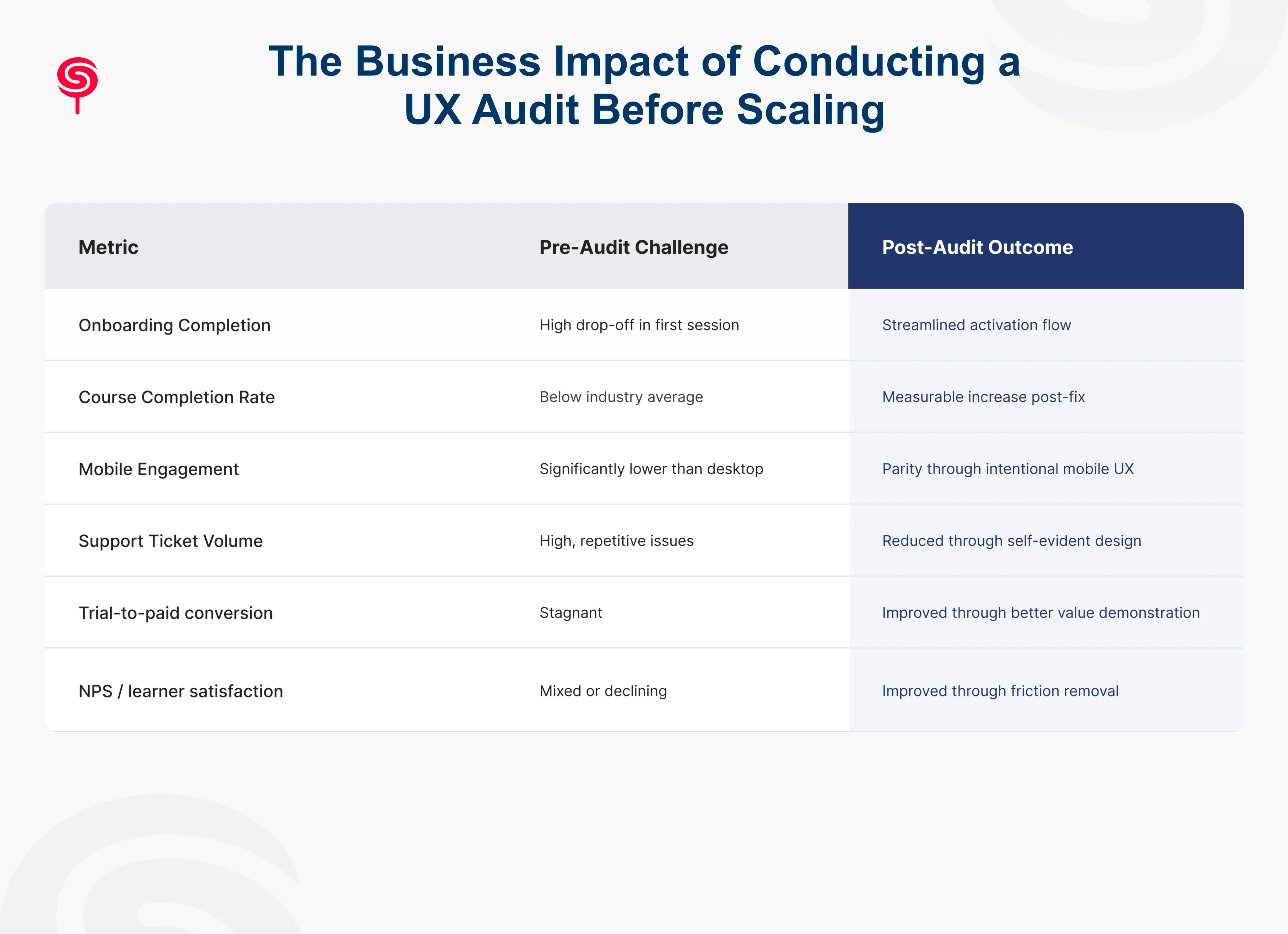
Let's talk numbers. Because this isn't just a design conversation it's a growth conversation.
Completion Rates and Revenue Per User
Every percentage point increase in course completion directly impacts renewal, upsell, and referral revenue. A learner who completes a course is dramatically more likely to purchase the next one. Platforms that invest in UX optimization routinely see completion rate improvements of 20–40% from targeted experience improvements.
Reduced Customer Acquisition Cost
When UX drives organic referrals and word-of-mouth, CAC drops. A student who had a transformative learning experience becomes a distribution channel. A student who struggled through a confusing platform tells no one or worse, posts a negative review.
Lower Churn, Higher LTV
The cost of acquiring an education customer is high. Extending their active lifecycle from 6 months to 18 months through better engagement design can triple lifetime value without touching your acquisition strategy.
Faster Product Cycles Post-Audit
Teams that understand their UX problems ship with more confidence. Instead of debating which features to build, they're executing against a prioritized, evidence-based roadmap. Development resources stop being wasted on features that don't address real friction.
Investor-Ready Product Narrative
For funded or fundraising startups, a documented UX audit demonstrates product maturity and user-centric thinking. It shows investors that growth is being built on a solid foundation not on a leaky bucket with an aggressive refill strategy.
Conclusion
The EdTech market is growing faster than at any point in history. The platforms that will win are not necessarily the ones with the most content, the most features, or the largest marketing budgets. They will be the ones whose learners trust the experience enough to stay, complete, and return.
A UX audit for your learning platform is not a cost center. It is the highest-leverage investment you can make before scaling a systematic way to ensure that every dollar of growth investment lands on a foundation built to retain and convert.
If you're preparing to scale your education platform, or if any of the signals in this article resonated, now is the time to act. The problems don't disappear with growth. They compound.
Frequently Asked Questions
1. Why should a startup conduct a UX audit before scaling?
Scaling amplifies existing user experience issues. A UX audit identifies and resolves growth blockers before they become expensive problems.
2. Do I need a UX audit if my platform is early-stage?
If you have real users and real data, a focused audit is valuable at any stage. Early-stage audits are often more cost-effective because issues are caught before they're baked into a larger product surface area. They also establish UX discipline as a core practice from the beginning which pays compound returns.
3. How is a UX audit different from user testing?
User testing observes how real users interact with your product. A UX audit is an expert-led analysis that combines heuristic evaluation, journey mapping, analytics interpretation, and accessibility review. They are complementary audits often identify hypotheses that user testing can then validate.
4. When is the right time to conduct a UX audit?
The best time is before a major scaling initiative, funding round, product release, or market expansion. Second best is when you're seeing declining engagement, high churn, or low completion rates. There is no bad time but earlier is always cheaper.
Share this blog!
Latest Blogs
Explore our latest insights on design, AI, and digital innovation.


