UX Audit for Mobile Apps: Increase Daily Active Users
Author
Vignesh
Published On

This is the silent crisis most mobile apps face between months two and six post-launch, and it has a name: UX-driven churn. It isn't caused by bugs, poor marketing, or product-market fit. It's caused by friction invisible, accumulated, death-by-a-thousand-cuts friction baked into how your product was designed.
Here's the hard truth most startup founders and product managers avoid confronting: users don't complain before they leave. They just leave. And every day you operate without understanding exactly where, why, and how they disengage, you're bleeding retention you'll never recover.
A professionally executed UX audit is how you stop the bleed, understand the failure points, and build a design-led growth engine. This guide breaks down exactly why apps lose DAUs, what a UX audit uncovers, and how aligning UX strategy with business outcomes transforms retention curves.
Why Most Mobile Apps Lose Daily Active Users
The Onboarding Illusion
Most teams celebrate installs. They shouldn't.
An install only means someone was curious enough to download your app. It says nothing about whether that person will return tomorrow, complete a core action, or become a paying user. The data is damning: industry benchmarks show that 77% of users stop using an app within the first three days of install. The majority churn before they ever understand your product's core value.
The culprit is almost always a broken onboarding experience screens that explain features rather than deliver immediate value, sign-up flows that ask for too much information too early, and permission requests (camera, notifications, location) fired at users before they have any reason to trust the app.
This is a product UX failure, not a marketing failure. No amount of retargeting spend recovers a user who abandoned during onboarding because your UX demanded too much, too soon.
Feature Overload and Cognitive Friction
SaaS companies are especially prone to this: the roadmap-as-interface problem. Every stakeholder's favorite feature makes it into the navigation. Every use case gets its own tab. The result is a dashboard so dense that users can't find the one thing they came to do.
Cognitive friction the mental effort required to navigate, interpret, and interact with an interface is the most underestimated cause of DAU decline. It doesn't announce itself. Users don't file a ticket that says "your navigation is confusing." They simply open a competitor's app instead, because it took two taps to do what yours takes seven.
Consider a common scenario: a SaaS analytics tool that buried its most-used report three levels deep in a sidebar menu. Users arrived, couldn't quickly find what they needed, and opened a spreadsheet instead. The feature existed. The value was real. The UX hid it.
The Trust and Feedback Vacuum
Users form judgments about product quality within seconds. Inconsistent typography, buttons that don't respond immediately, loading states with no visual feedback, and error messages written in developer-speak all erode trust. None of these are catastrophic in isolation. Together, they signal to the subconscious: this product isn't finished or this company doesn't care about my experience.
For growth-stage startups, this perception gap is devastating. You may have built genuinely powerful technology. But if the interface feels rough, users assign rough to the entire brand.
Poor Task Completion Paths
Every user arrives with a job to be done. They want to schedule, analyze, track, communicate, or create something specific. Product adoption problems emerge when the path from arrival to task completion is unclear, interrupted, or inefficient.
Classic examples of UX friction on task completion paths include checkout flows with too many steps, collaboration tools that require too many invitations before a team can function, content platforms that bury the upload button, and productivity apps with no clear starting point for a new user session.
Each friction point represents a moment where a user had to make an effort they weren't willing to make. Multiply that across thousands of daily sessions and you get a DAU graph that trends in the wrong direction.
User struggles and product friction: what actually kills DAU
Users don’t abandon apps because they’re malicious; they leave because the product asks too much, delivers too little, or creates confusion. Common, measurable friction points we see:
Onboarding overload: too many steps, unclear value, or required inputs that block first-run success.
Poor task discoverability: essential features hidden in deep menus or non-standard patterns.
Time-to-value too long: users must complete multiple tasks before experiencing the core benefit.
Confusing information architecture: inconsistent labels, duplicate functions, and mixed mental models.
Performance and feedback gaps: slow screens, lack of progress indicators, no error recovery paths.
Cognitive load spikes: dense screens, jargon, or demands for decisions without context.
Mismatch with user goals: features prioritized for product metrics rather than user outcomes.
Each friction increases drop-off at a measurable touchpoint: activation funnels, retention curves, time-on-task metrics, and NPS.
Why most apps lose daily active users
It’s tempting to blame marketing or pricing. Often the root cause is product UX that prevents habit formation. Key reasons include:
Misaligned onboarding metrics: teams optimize for sign-ups, not activation (first meaningful action).
Complexity creep: feature bloat raises learning cost and reduces clarity on the core value.
Optimization in silos: product, growth, and engineering optimize separate KPIs, creating conflicting UX decisions.
Lack of user signals: teams build from opinions and analytics sampling, not mixed-method research.
No retention playbook: product roadmaps focus on acquisition, lacking deliberate hooks to drive repeat use.
These problems compound: a 10% increase in friction at onboarding often causes a far larger percentage drop in 7-day and 30-day retention. Fixing surface metrics without addressing underlying UX causes creates temporary gains only.
UX audit as the strategic solution
A UX audit is not a cosmetic checklist. Done strategically, it diagnoses how product experiences map to user goals and business outcomes. For startups and SaaS teams focused on DAU, a UX audit:
Exposes the precise moments where users abandon the product experience.
Prioritizes fixes by business impact (activation, retention, revenue).
Provides a playbook for product changes that reduce churn and lift habitual use.
Think of a UX audit as translating qualitative user needs and quantitative signals into a prioritized roadmap that designers and PMs can implement quickly to move retention metrics.
The UX Audit Framework: What a Strategic Process Looks Like
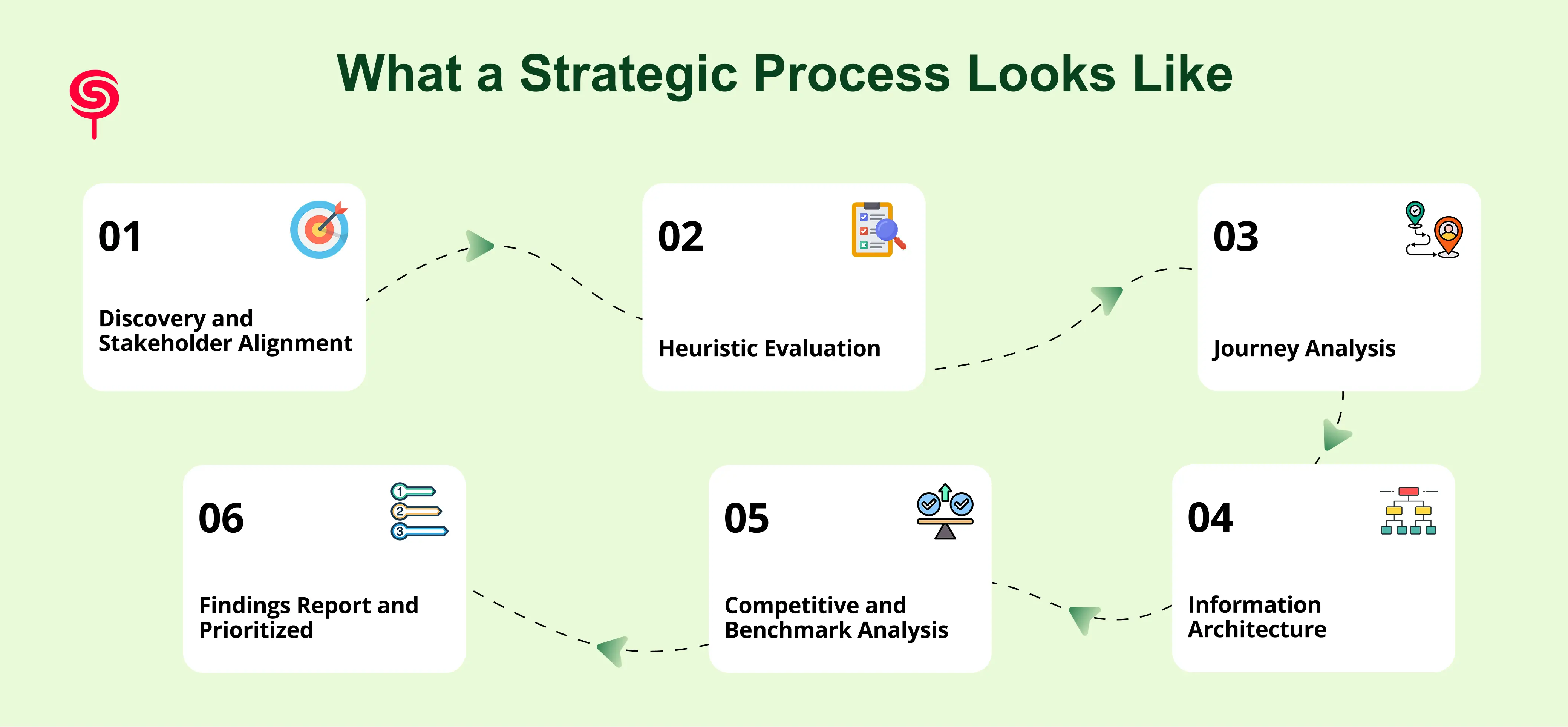
Phase 1: Discovery and Stakeholder Alignment
Before a single screen is analyzed, the audit must be grounded in business objectives. This phase involves aligning with founders, product managers, and growth leads on what success looks like: which metrics need to move, which user segments matter most, and what product-level hypotheses the team is already working with.
Inputs at this stage: analytics data (session recordings, funnel drop-offs, heatmaps), user support tickets, churn surveys, NPS feedback, and any prior research. These aren't just background reading they become the evidentiary backbone for every finding that follows.
Phase 2: Heuristic Evaluation
Trained UX strategists evaluate every screen in your app against established usability principles: Nielsen's 10 Usability Heuristics, WCAG accessibility standards, and platform-specific guidelines for iOS Human Interface Guidelines and Android Material Design. Each violation is logged with severity scoring critical issues that directly prevent task completion versus moderate issues that create unnecessary friction versus minor issues that affect polish.
This phase typically surfaces 40–80 discrete findings in a mature app, many of which the internal team has become blind to through familiarity.
Phase 3: User Flow and Journey Analysis
This phase maps every primary user journey against behavioral data. Where are the gaps between intended flow and actual user behavior? Screen-level drop-off rates are correlated with specific design decisions. Session recordings are reviewed for hesitation patterns, rage clicks, and dead-end navigation behaviors.
For mobile apps specifically, this includes gesture interaction analysis, scroll depth mapping, and cross-device behavior patterns for apps used across phone and tablet.
Phase 4: Information Architecture and Navigation Review
Users navigate by intuition. Your navigation structure either matches their mental model or it doesn't. This phase assesses whether your information architecture how content, features, and functions are organized and labeled aligns with how target users actually think about your product.
Card sorting data, tree testing results, and navigation analytics are used to identify mismatches between product structure and user expectation. This is where the "hidden feature" problem is most often diagnosed.
Phase 5: Competitive and Benchmark Analysis
Your users use other apps. Their expectations are shaped by the best UX they've encountered anywhere, not just in your category. This phase benchmarks your app against direct competitors and best-in-class UX examples to identify where you're falling behind on interaction patterns, visual hierarchy, and feature discoverability that users now consider standard.
Phase 6: Findings Report and Prioritized Recommendations
Every audit concludes with a prioritized remediation roadmap not a flat list of problems. Findings are organized by impact on business objectives, effort required, and strategic sequencing. Quick wins (high impact, low effort) are separated from structural redesigns (high impact, high effort) so product teams can make informed decisions about where to start.
Each recommendation is tied back to a specific metric: reducing drop-off on a particular screen, improving time-to-first-value for new users, or increasing feature discovery rates for high-retention actions.
Business Outcomes: What UX Audits Actually Move
Measurable Retention Improvements
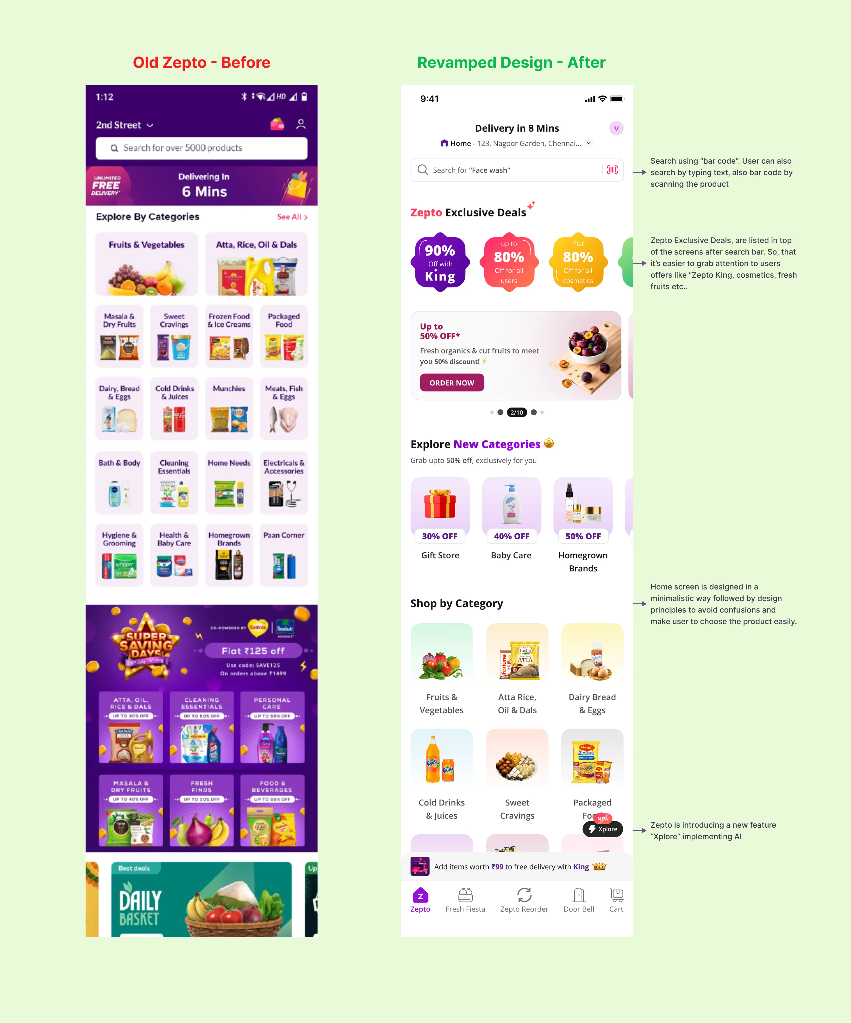
Retention is the metric most directly influenced by UX quality. Teams that act on audit findings consistently report material improvements in Day 7 and Day 30 retention rates. Simplifying onboarding to deliver value faster, reducing navigation steps to core tasks, and fixing high-severity friction points in primary user flows have driven 15–40% improvements in DAU consistency for app teams that implement audit recommendations systematically.
Reduced Customer Acquisition Cost
Every user you retain is a user you don't have to reacquire. When retention improves from 20% at Day 30 to 35%, your paid acquisition budget works significantly harder. The same ad spend delivers more active users because more of the users you acquire actually stick. For growth-stage startups spending aggressively on user acquisition, improving UX is one of the highest-leverage investments available.
Increased Feature Adoption and Monetization
The features users don't discover are the features that don't drive revenue. UX audits routinely surface high-value product capabilities that are underutilized not because users don't want them, but because they can't find them. Improving feature discoverability for premium or conversion-driving functions has a direct impact on upgrade rates, in-app purchase conversion, and subscription tier advancement.
Faster Product Iteration Cycles
When your team knows exactly which parts of the UX are underperforming and why, sprint planning becomes more targeted. Resources stop being allocated to features built on assumption and start being directed toward improvements backed by audit evidence. Product teams that operate from a UX audit baseline ship changes with more confidence and waste less cycle time on work that doesn't move metrics.
Investor-Ready Growth Metrics
DAU growth, retention curves, and feature engagement rates are the metrics that matter most in growth-stage fundraising conversations. A UX audit that demonstrably moves these metrics gives founders a concrete, evidence-based narrative for how the product is being improved systematically not reactively.
UX Audit as Strategic Growth Partnership
The most effective UX audits aren't one-time deliverables. They are the beginning of an ongoing strategic relationship between a design consultancy and a product team.
The first audit establishes a baseline and clears the backlog of accumulated friction. Subsequent quarterly or bi-annual audits track whether implemented changes moved the right metrics, identify new friction that emerged from product growth, and continuously align UX decisions with evolving business priorities.
For SaaS teams and mobile app businesses at the growth stage, this kind of embedded UX strategy is the difference between building a product that users tolerate and building one they recommend.
Your users are already telling you something is wrong. They're telling you with their behavior their drop-offs, their shortened sessions, their silence in the feedback channels. A UX audit gives you the fluency to hear what they're not saying.
Ready to Know Why Your Users Are Leaving?
If your daily active user numbers aren't where they should be, the answer is inside your product not in your next campaign or your next feature. A UX audit is how you find it.
We work with SaaS companies, mobile app teams, and growth-stage startups to diagnose UX friction, build prioritized remediation roadmaps, and connect every design recommendation to the business metrics that matter. Our process is evidence-based, outcome-driven, and built for teams that can't afford to guess.
Conclusion
Retention is a design problem as much as a growth one. A structured UX audit uncovers the specific usability and product-friction issues blocking habitual use, then maps fixes to measurable business outcomes. For startups and SaaS teams chasing sustainable DAU growth, investing in a UX audit is an efficient, evidence-driven way to reduce churn, increase activation, and raise lifetime value.
Frequently Asked Questions
1. What is a UX audit for mobile apps?
A UX audit is a structured review that combines quantitative analytics, heuristic evaluation, session replays, and user research to diagnose product friction and prioritize UX improvements that improve activation and retention.
2. How does a UX audit increase Daily Active Users?
A UX audit improves onboarding, reduces usability friction, simplifies navigation, and enhances engagement loops, helping users return to the app more consistently.
3. What metrics should startups track during and after an audit?
Activation rate (first meaningful action), 7-day and 30-day retention, DAU/MAU ratio, time-to-first-value, feature adoption rates, and support ticket volume.
4. How much improvement can I expect from a UX audit?
Typical outcomes include a 10–40% lift in activation and 15–60% improvement in short-term retention for cohorts experiencing optimized flows. Exact results depend on product maturity and implementation quality.
Share this blog!
Latest Blogs
Explore our latest insights on design, AI, and digital innovation.