Why Most Course Platforms Lose Users After Sign-Up
Author
Vignesh
Published On

Founders often assume a signup is a win. In reality, sign-up is only the beginning of the activation problem, and many online learning platforms leak users before they ever reach a meaningful learning moment.
That is why learner retention, user retention in eLearning, and course completion rate should be treated as product design outcomes, not just marketing metrics. When learners do not quickly understand what to do next, they disengage, and the platform starts to feel heavy, confusing, or optional
Why Do Most Course Platforms Lose Users After Sign-Up?
Sign-up is the easiest part of the learner journey. Anyone can fill out a form. The real test begins in the first session, when a new user has to answer an unspoken question: is this worth my time?
Most course platforms fail that test in the first five minutes, for a few consistent reasons:
The first session has no clear next step. Users land on a dashboard full of options and no direction, and indecision quickly turns into inactivity.
Value is promised, not shown. Landing pages sell transformation; the product itself often delivers a static syllabus with no early win.
Onboarding is treated as a form, not a journey. Account creation is optimized. What happens after the account exists rarely is.
There's no feedback loop. Learners don't see progress, so they don't feel progress and what isn't felt isn't repeated.
None of this is due to bad intentions. It's due to onboarding being built by engineering logic ("what does the system need to function") instead of learner psychology ("what does a new user need to feel supported"). That gap is where most course completion rate problems begin.
Where Users Drop Off in the Learning Experience
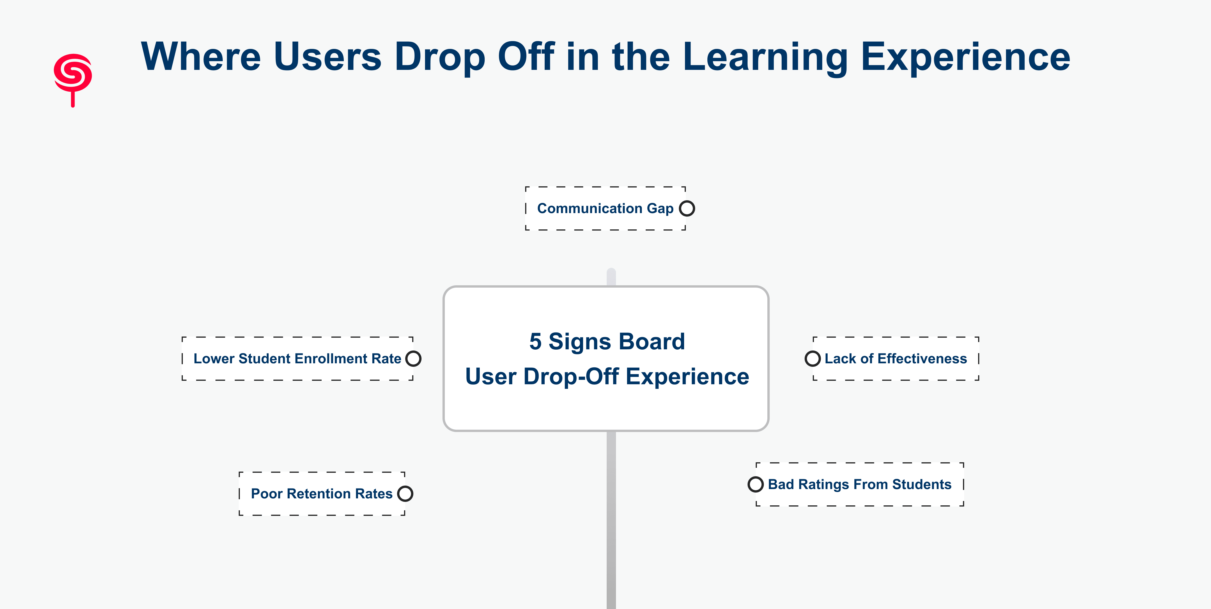
Drop-off isn't one event it's a series of small exits scattered across the journey. Five patterns show up again and again in platform audits.
Poor Retention Rates
Industry benchmarks for online course retention are sobering: many self-paced platforms see completion rates in the single digits, and even strong cohort-based programs struggle to keep majority engagement past week two. When retention is this fragile, small UX friction has an outsized effect on lifetime value.
Lower Student Enrollment Rate
Retention problems quietly suppress enrollment too. Word-of-mouth referrals, testimonials, and case studies all depend on learners actually finishing something. A product that can't retain users in-session eventually can't acquire new ones cheaply either, because the proof of outcomes dries up.
Communication Gap
Learners frequently don't know what's expected of them how long a course takes, what "done" looks like, or when to expect check-ins. Silence between sign-up and re-engagement reads as abandonment, even when the platform intends to follow up later.
Lack of Effectiveness
If a learner can't point to a skill, certificate, or outcome after using the product, the platform hasn't demonstrated effectiveness regardless of how good the content actually is. Perceived effectiveness is a UX outcome as much as a curriculum outcome.
Bad Ratings From Students
Negative reviews rarely cite content quality. They cite confusion: "didn't know where to start," "too complicated," "felt lost." These are onboarding UX failures wearing a content complaint's clothing, and they compound into public trust damage over time.
UX Strategies That Keep Learners Engaged
Fixing this isn't about redesigning the whole platform. It's about re-sequencing the experience around a few proven principles.
1. Design for the first win, not the full curriculum. The first session should deliver one small, complete outcome a finished micro-lesson, a working exercise, a visible milestone within minutes, not days.
2. Replace choice overload with a guided path. New users don't want a menu; they want a next step. A single, obvious call-to-action beats ten equally-weighted options.
3. Make progress visible. Progress bars, streaks, and completion percentages aren't cosmetic they give learners tangible evidence that effort is accumulating toward something.
4. Close the communication loop. Timely, contextual nudges (not generic drip emails) re-engage users based on what they actually did or didn't do in-product.
5. Personalize the path. Adaptive sequencing based on goals, skill level, or role signals to the learner that the platform understands them individually, not as a cohort average.
Build an Onboarding Flow That Encourages Action
A strong user onboarding for learning platforms flow follows a simple arc: orient, commit, act, reward.
Orient: Ask 1–2 questions about the learner's goal before showing any content. This single step reframes the entire dashboard around relevance.
Commit: Have the learner set a lightweight, self-chosen target (a course, a deadline, a weekly cadence) rather than defaulting to platform-wide pacing.
Act: Push them directly into a short first task no lengthy intro video, no syllabus wall within the first two minutes of the session.
Reward: Confirm the action clearly. A completion state, a badge, or a simple "you're 10% through Module 1" message closes the loop and creates momentum for the next visit.
This sequence directly targets first-time user experience metrics, which are consistently the strongest predictor of 30-day retention across learning products.
UX Improvements That Directly Impact Learning Success
Several specific design patterns show up repeatedly in high-retention platforms:
Dashboard UX that answers "what's next" in under three seconds no scanning, no interpretation required.
Course discovery built around intent, not catalog structure surfacing relevant content instead of an alphabetized library.
Microlearning structures that break content into completable units rather than long, intimidating modules.
Contextual help embedded in the flow, replacing separate help centers that learners never visit.
Mobile-first continuity, so a learner can start on desktop and resume on a phone without losing state.
Each of these is a learning platform design decision with a measurable downstream effect on completion, not a cosmetic preference.
Measure the Right KPIs Before Redesigning
Redesigns fail when they're driven by opinion instead of data. Before touching the interface, teams should baseline:
Activation rate percentage of new sign-ups who complete a meaningful first action within 24–48 hours.
Day 7 and Day 30 retention the clearest read on whether onboarding created lasting habit formation.
Course completion rate segmented by course length and format, since long-form and micro-content behave very differently.
Time-to-first-value how long it takes a new user to reach their first tangible win.
Drop-off point mapping the exact step in the funnel where the largest percentage of users disappear.
These KPIs turn a vague sense of "engagement feels low" into a prioritized, fundable roadmap.
Warning Signs Your Learning Platform Needs a UX Redesign
A UX audit is overdue if any of the following sound familiar:
Activation rate has stalled or declined over the last two quarters.
Support tickets repeatedly mention confusion about "where to start."
Analytics show a sharp cliff in the first session, well before course content ends.
The product roadmap keeps adding features while retention numbers stay flat.
Reviews mention "hard to use" or "confusing" more than they mention content quality.
Any one of these is a signal. Three or more is a mandate.
Great Learning Experiences Create Long-Term Competitive Advantage
In a market where content is increasingly commoditized the same subject matter is available across dozens of platforms learning experience design is one of the few remaining differentiators a company fully controls. Platforms that solve for activation and retention compound their advantage in three ways:
Lower acquisition costs, because retained learners generate organic referrals and testimonials.
Higher lifetime value, because completion and renewal are directly tied to felt progress.
Stronger brand trust, because learner outcomes not marketing claims become the product's proof.
This is the compounding return of a UX investment: it doesn't just fix a leak, it becomes the growth channel.
Why CandyStudio
CandyStudio Design Agency works specifically at the intersection of EdTech UX design and business outcomes not aesthetics for their own sake. Our UX audits map the exact points where learners disengage, tie those points to activation and retention KPIs, and hand back a prioritized redesign plan founders can act on immediately, whether that's an onboarding overhaul, a dashboard rebuild, or a full learning journey redesign.
We've worked alongside EdTech founders, LMS teams, and SaaS learning products to move activation and completion numbers that had been flat for quarters because the fix was never the curriculum, it was the experience wrapped around it.
Business Outcomes and Growth Strategy
The platforms that win the next phase of EdTech and online learning won't be the ones with the most content. They'll be the ones whose product experience makes learners want to come back measured in activation rate, Day 30 retention, and completion percentage, not just sign-up volume.
If your team suspects the product is leaking users after sign-up, the fastest way to find out is a structured UX audit that maps your actual drop-off points against your funnel data.
Ready to see exactly where your learners are disengaging? Book a UX Audit with CandyStudio and get a data-backed roadmap for activation and retention before your next roadmap cycle locks in.
Conclusion
The most successful EdTech companies understand that learner retention is a product design challenge as much as it is an educational one. By simplifying onboarding, reducing friction, personalizing learning paths, reinforcing progress, and measuring the right behavioral metrics, they transform first-time visitors into active learners and long-term customers.
If your platform attracts registrations but struggles with activation, engagement, or completion, improving the user experience is one of the highest-impact investments you can make. A strategic UX audit reveals where learners lose momentum and provides a roadmap for creating a product that supports both educational success and sustainable business growth.
Rather than asking, "How can we acquire more users?" start asking, "How can we help every learner succeed from their very first session?" That shift in perspective is often the difference between a platform that grows through constant acquisition and one that grows through exceptional user experience.
Frequently Asked Questions
1. Why do learners quit online courses?
Most learners quit because they encounter friction during onboarding, unclear learning paths, poor motivation systems, or an overwhelming user experience. Simplifying the journey and reinforcing progress helps improve retention.
2. What causes learner drop-off after sign-up?
Learner drop-off commonly results from confusing onboarding, weak personalization, limited progress visibility, poor navigation, and a lack of engagement mechanisms that encourage consistent learning.
3. How can UX improve course completion?
UX improves course completion by reducing friction, guiding learners toward the next action, providing personalized recommendations, visualizing progress, and supporting habit formation through reminders and milestones.
4. What are the biggest UX mistakes in EdTech platforms?
Common mistakes include information-heavy dashboards, poor mobile experiences, unclear navigation, generic onboarding, weak course discovery, lack of progress tracking, and minimal personalization.
5. How does a UX audit benefit an LMS or course platform?
A UX audit uncovers usability issues, behavioral friction, and learner drop-off points across the user journey. It provides actionable recommendations to improve activation, engagement, retention, and overall business performance while reducing costly trial-and-error redesigns.
Share this blog!
Latest Blogs
Explore our latest insights on design, AI, and digital innovation.