UX Audit for Education Platforms: Improving Student Engagement
Author
Vignesh
Published On

The Student Engagement Problem Most Education Platforms Overlook
Many education platforms invest heavily in content creation, technology infrastructure, and marketing acquisition. Yet student engagement remains stubbornly low.
Students sign up, browse a few lessons, and disappear before completing courses. Product teams often assume the issue lies in content quality, pricing, or marketing. In reality, the learning experience itself may be creating friction that prevents students from progressing.
A strategic UX audit for education platforms helps uncover the hidden usability, navigation, and workflow issues that negatively impact engagement, retention, and learning outcomes.
In this article, we'll explore how UX audits help EdTech companies identify engagement bottlenecks, improve student experiences, and drive measurable business growth.
Why Student Engagement Is the Biggest Challenge for Education Platforms
Student engagement isn't a soft metric. It is the revenue metric.
Consider what engagement actually drives in an EdTech business model: course completions trigger word-of-mouth referrals. High session frequency reduces churn. Progress milestones create emotional investment. Emotional investment drives upsells, renewals, and community participation.
When engagement breaks down, the entire revenue flywheel stalls.
Industry data consistently shows that the average online course completion rate sits between 5% and 15%. Even well-funded platforms with strong content libraries struggle to hold learner attention past the first two sessions. The problem isn't that people don't want to learn people pay hundreds of dollars for courses they genuinely intend to finish. The problem is that the product gets in the way of the learning.
Friction in the wrong place doesn't just frustrate users. It reframes the entire product experience. A student who can't find where they left off isn't thinking "the navigation is confusing" they're thinking "this platform isn't for me." A learner who can't complete a quiz on mobile isn't filing a bug report they're unsubscribing.
Why Traditional Engagement Strategies Often Fall Short
Most EdTech teams facing engagement problems reach for familiar playbooks: send more email reminders, add a gamification layer, build a community forum, push notifications.
These tactics can work. But they work on top of a functional UX. Deployed on top of a broken one, they accelerate abandonment because you're driving more traffic into a leaky system.
Here's what happens in practice:
The notification trap. You increase push notifications, which brings users back to the app. But the moment they encounter the same confusing navigation or broken mobile experience, they opt out entirely and now you've lost a re-engagement channel.
The gamification band-aid. Badges and streaks create short-term spikes. But gamification doesn't fix a course structure that's hard to navigate or a learning workflow that interrupts momentum at every step. The novelty fades in days.
The content volume fallacy. Adding more courses to a platform with poor information architecture doesn't improve engagement it increases cognitive load and decision paralysis. Students open the library, feel overwhelmed, and close the tab.
The real issue is structural. Engagement lives downstream of usability. Before engagement strategies can deliver ROI, the foundation the UX has to actually work.
What Is a UX Audit for Education Platforms?
Understanding the Purpose of a UX Audit
A UX audit is a structured, evidence-based evaluation of your platform's user experience. It answers a precise question: Where and why are users failing to achieve their goals?
Unlike a general product review or stakeholder feedback session, a UX audit uses a defined methodology to evaluate your product against established usability principles, actual user behavior data, and education-specific engagement patterns. The output isn't a list of opinions it's a prioritized roadmap of experience failures ranked by their business impact.
For education platforms specifically, the purpose extends beyond standard usability. A UX audit must evaluate how well the product supports learning platform not just navigation efficiency. That means examining cognitive load across lesson structures, the quality of progress feedback loops, how the platform handles learner frustration points, and whether the product design reinforces or undermines motivation.
Key Areas Evaluated During a UX Audit
A thorough UX audit for a learning platform examines:
Onboarding flows: Do new students reach their first value moment quickly, or do they get lost in account setup?
Navigation and information architecture: Can students find their courses, track their progress, and resume where they left off without friction?
Learning workflow continuity: Does the product support uninterrupted learning sessions, or does it introduce unnecessary decision points mid-lesson?
Mobile and cross-device experience: Is the platform genuinely usable on a phone, or is mobile an afterthought?
Accessibility compliance: Does the platform meet WCAG standards, and are there barriers that exclude segments of your audience?
Feedback and progress visibility: Do students always know where they are, what's next, and how far they've come?
Error and empty states: How does the product behave when something goes wrong or when a student hits a dead end?
How UX Audits Identify Engagement Bottlenecks
The audit process triangulates findings across three data layers: behavioral analytics (what users actually do), heuristic evaluation (what experts identify as friction against established principles), and usability testing (where real users get stuck when observed in real-time).
This triangulation is critical because any single method tells an incomplete story. Analytics show you where users drop off but not why. Heuristic evaluation identifies structural problems but can't predict which ones matter most to your specific audience. Usability testing reveals the "why" but is limited in scale. Together, they create a diagnostic picture no single method can produce alone.
UX Audit vs. General Product Review
A product review asks: "What features should we build next?"
A UX audit asks: "What's broken in what we've already built?"
These are fundamentally different questions that require different methodologies. EdTech teams frequently mistake stakeholder feedback, NPS surveys, or analytics reviews for a UX audit. While these inputs are valuable, none of them constitute a structured audit. A UX audit is a formal process with defined criteria, specific deliverables, and actionable findings mapped to measurable outcomes.
A Strategic UX Audit Framework for Education Platforms
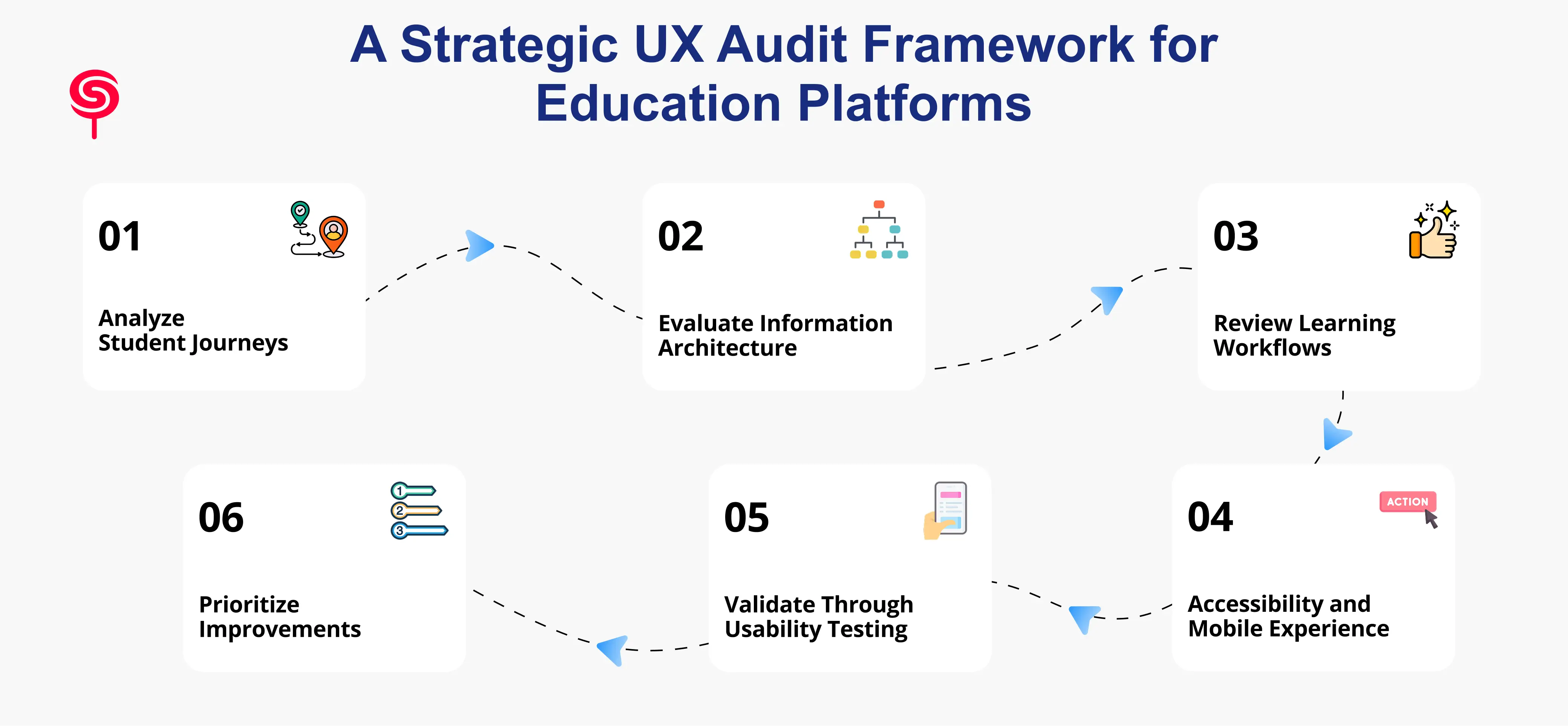
Step 1 – Analyze Student Journeys
Every UX audit begins with mapping how students actually move through your platform not how you designed them to move through it. These two are rarely identical.
Student journey analysis identifies the key touchpoints: initial signup, onboarding, first course entry, progress tracking, lesson completion, assessment, and re-engagement after a break. At each touchpoint, the audit documents the actions students take, the decisions they face, and the friction they encounter.
This step frequently surfaces "invisible" drop-off points moments where students quietly exit that never show up in course completion data because they happen before students ever truly begin.
Step 2 – Evaluate Information Architecture
Information architecture (IA) governs how content is organized, labeled, and navigated. For learning platforms, poor IA is one of the highest-impact problems because it affects every student on every session.
The audit evaluates whether your course hierarchy makes sense to a new student, whether navigation labels match how learners think (not how your internal team categorizes content), and whether search and filtering tools actually help students find what they need. Card sorting and tree testing exercises are often used to validate or challenge existing IA assumptions.
Step 3 – Review Learning Workflows
Learning workflows are the sequences students follow to consume content, complete exercises, submit assessments, and receive feedback. Disruptions in these workflows are among the most damaging UX failures in EdTech because they break the cognitive state required for effective learning.
The audit examines whether lesson structures support sustained attention, whether the platform handles interruptions gracefully (e.g., a student who must close the app mid-lesson), and whether workflow design creates momentum or repeatedly forces students to re-orient themselves.
Step 4 – Accessibility and Mobile Experience
In 2025, mobile-first is no longer optional it is the baseline expectation for any consumer-facing learning platform. The audit evaluates your platform's mobile experience against real usage conditions: small screens, intermittent connectivity, touch navigation, and one-handed use.
Accessibility evaluation examines WCAG 2.1 compliance across contrast ratios, keyboard navigation, screen reader compatibility, and media alternatives. Beyond compliance, accessibility improvements consistently benefit all users not just those with specific needs.
Step 5 – Validate Through Usability Testing
Heuristic evaluation finds structural problems. Usability testing reveals how real students experience them.
Moderated usability sessions observe students completing defined task enrolling in a course, finding a previously started lesson, submitting an assignment while narrating their thought process. These sessions surface confusion, hesitation, and workarounds that no analytics tool can capture. Even a small number of sessions (five to eight participants) consistently reveals patterns that generate high-priority findings.
Step 6 – Prioritize Improvements Based on Impact
A UX audit generates findings sometimes dozens of them. The final and most strategically important step is prioritization: mapping every finding to its estimated impact on engagement, retention, and conversion, then sequencing improvements accordingly.
Not all UX problems are equal. A broken mobile quiz flow affects every student on every device. A suboptimal color choice on a tertiary settings page affects almost no one. Effective audit deliverables distinguish between critical fixes, high-impact improvements, and lower-priority polish giving product teams a clear, actionable roadmap rather than an overwhelming list.
Key UX Improvements That Increase Student Engagement
Based on recurring findings across EdTech UX audits, the following improvements consistently deliver the highest engagement impact:
Streamlined onboarding sequences. Reducing the time-to-first-value the moment a new student experiences the core benefit of your platform dramatically improves activation rates. This typically means shortening account setup, skipping unnecessary steps, and guiding students directly into a learning experience before asking them to configure their profile.
Persistent progress indicators. Students who can see where they are and how far they've come are significantly more likely to continue. Progress bars, completion percentages, and "resume where you left off" features are low-complexity, high-return improvements that many platforms still handle poorly.
Simplified course navigation. Clear, consistent navigation that students can rely on without thinking frees cognitive bandwidth for actual learning. Consistent placement of navigation elements, clear labeling, and logical content hierarchy reduce the "where am I?" disorientation that kills session depth.
Mobile-optimized learning flows. Redesigning core learning interactions video players, quizzes, assignments specifically for mobile rather than adapting desktop interfaces produces measurable improvements in mobile session length and completion rates.
Friction-reduced assessment flows. Assessments are high-stakes, high-anxiety moments for learners. UX improvements here clear instructions, forgiving error handling, progress visibility during multi-part assessments directly reduce abandonment at the moments that matter most for learning outcomes.
Contextual motivation design. Micro-copy, milestone celebrations, and progress reinforcement integrated into the learning flow rather than bolted on as gamification layers create a more sustainable engagement architecture.
Measuring Engagement Before and After a UX Audit
A UX audit is not a subjective exercise. Its success is measurable and you should define your measurement framework before improvements are deployed, not after.
Key metrics to baseline before an audit and track through post-implementation cycles:
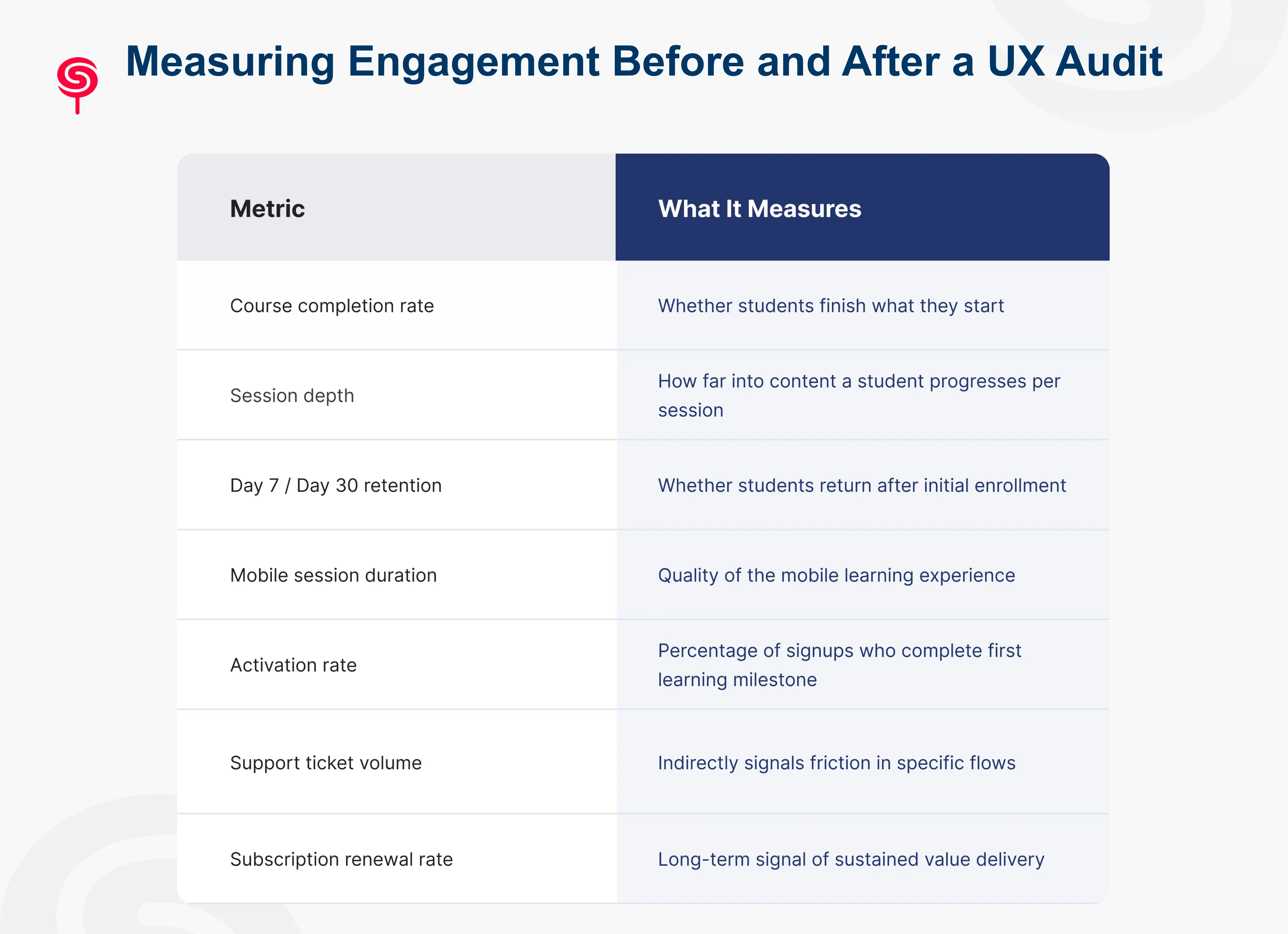
Typical outcomes from rigorous UX audit implementations in EdTech include 20–40% improvements in course completion rates, 15–30% reductions in churn within the first post-launch quarter, and meaningful increases in referral and organic growth as the product experience improves.
Business Benefits of UX Audits for EdTech Startups
The business case for a UX audit isn't abstract. It compounds directly into the metrics that determine the trajectory of an EdTech company.
Reduced churn. The most immediate business impact. Students who can use the platform without friction are students who renew subscriptions. Every percentage point of churn reduction in a subscription model compounds significantly over a 12-month horizon.
Improved LTV. Engaged students complete courses. Students who complete courses trust the platform. Students who trust the platform buy more courses, upgrade to higher tiers, and recommend the product to peers. The LTV impact of engagement improvements is multiplicative, not linear.
Lower CAC pressure. When retention improves, you need fewer new students to hit growth targets. This fundamentally changes unit economics and gives early-stage EdTech companies more runway to scale sustainably rather than spending aggressively to replace churning users.
Competitive differentiation. Most EdTech products in any given category offer similar content quality and similar pricing. Exceptional UX is among the most durable competitive moats available to a learning platform because it is genuinely difficult to copy and directly affects whether students recommend your product to others.
Investor confidence. For EdTech startups in fundraising mode, demonstrable product quality supported by engagement metrics tells a cleaner story than content library size or user acquisition numbers alone.
Conclusion
Education platforms often focus on acquiring more learners while overlooking the experience that determines whether students stay engaged.
A strategic UX audit helps uncover hidden friction, optimize learning journeys, and improve the metrics that matter most from engagement and completion rates to retention and revenue growth.
For EdTech startups, LMS providers, and learning platforms, investing in UX is not simply about design improvements. It is about creating better learning outcomes and building a scalable growth engine.
Frequently Asked Questions
1. How do I know if my education platform needs a UX audit?
If your platform shows any of these signals course completion rates below 25%, high Day 7 churn, low mobile session duration, elevated support volume around navigation or access issues, or flat activation rates despite strong acquisition a UX audit will almost certainly surface actionable, high-impact findings.
2. Can a UX audit help with mobile learning experience specifically?
Yes. Mobile UX is one of the most consistently underoptimized areas in learning platforms and is a dedicated evaluation track in any rigorous EdTech UX audit. Findings typically include broken interaction patterns, poor video player performance, inaccessible assessment flows, and navigation structures that were never designed for thumb-based use.
3. Should a UX audit come before or after building new features?
Before. Building features on top of a broken UX amplifies the underlying problems and wastes development resources. A UX audit identifies what's failing in the current experience first giving your team the information needed to decide what to fix, what to remove, and only then, what to build next.
4.What deliverables should a UX audit produce?
A quality UX audit should deliver a detailed findings report with severity ratings, annotated screenshots documenting specific issues, journey maps highlighting drop-off points, an accessibility compliance summary, and a prioritized improvement roadmap with effort-impact estimates.
Share this blog!
Latest Blogs
Explore our latest insights on design, AI, and digital innovation.


