Why Good Products Fail: The UX Audit Perspective
Author
Vignesh
Published On
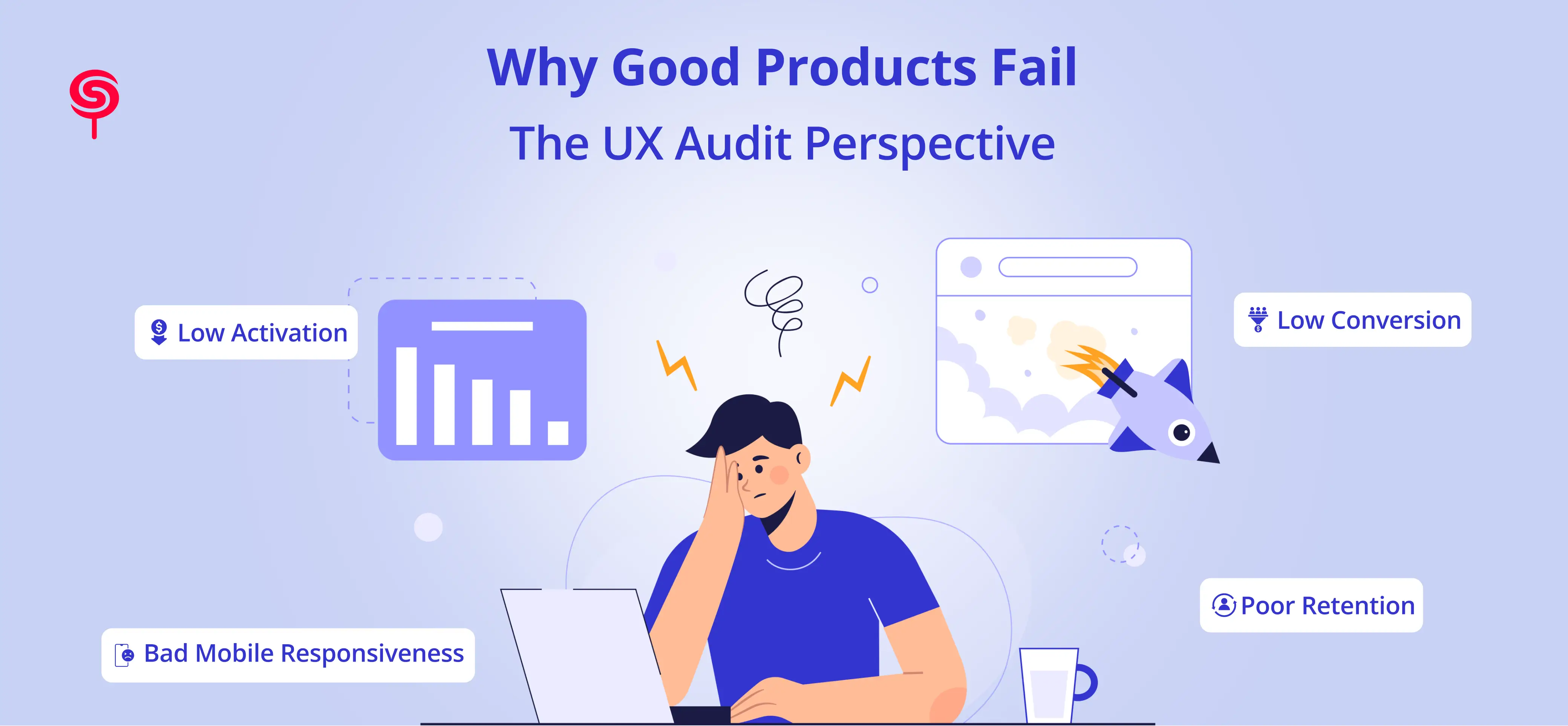
You have the funding. You have the team. You've shipped a product people should want. But your activation rates are flatlining, support tickets keep piling up, and users who signed up last month haven't come back since.
This isn't a marketing problem. It isn't a pricing problem. And it almost certainly isn't a product-market fit problem at least, not at its root.
It's a UX problem. And it's one most teams don't catch until it's already expensive.
This piece breaks down why good products fail, how a structured UX audit surfaces the real blockers, and what fixing them actually means for your bottom line.
The Uncomfortable Truth About Product Failure
The most dangerous product failures don't look like failures at first.
Traffic looks decent. Trial signups are growing. Your NPS sits at a neutral 6. Everything feels fine until you look at the 30-day retention curve and it drops off a cliff by day four.
This is the signature pattern of a UX problem masquerading as a growth problem. Teams respond by doubling the ad budget, rewriting the onboarding email sequence, or hiring another customer success rep. None of it works, because the root cause friction embedded in the product experience itself never gets addressed.
The stats paint a sobering picture. Research from Forrester consistently shows that improving UX Audit can increase conversion rates by up to 200%, and that poor usability is a primary driver of user abandonment. Yet most startups and SaaS teams spend less than 5% of their product budget on structured UX evaluation.
The gap between what users expect and what your product delivers is where growth goes to die.
The Real-World Problem When Good Products Lose Good Users
Low Activation: Users Arrive but Never Truly Start
Activation the moment a user first experiences the core value of your product is arguably the most critical event in the user lifecycle. Miss it, and no amount of drip email or retargeting will recover that user.
The brutal reality: most products have a broken path to activation and don't know it.
A SaaS team might define activation as "completes profile setup." But if completing that setup requires five form fields, an email confirmation, a verification step, and navigating two unintuitive menus users quit before they ever reach it. The feature works. The flow fails.
Product adoption problems almost always live in this gap between "the feature exists" and "the user can actually use it."
Poor Retention Despite Heavy Investment
Many teams respond to churn by investing in retention features loyalty mechanics, in-app messaging, and win-back campaigns. These can help. But if the underlying product experience is confusing, inconsistent, or exhausting to navigate, you're patching a cracked foundation.
Users don't churn because they forgot about you. They churn because using your product felt like work.
Low Conversion on High-Intent Pages
Your pricing page gets 4,000 visits a month. You convert 0.8% of them. You've A/B tested the headline. You've added a testimonial. Nothing moves.
This is a usability problem, not a copy problem. Cognitive overload, unclear CTAs, mismatched user expectations, or poor mobile rendering on a page that 60% of visitors see on their phones these are UX failures invisible to a copy review.
The Struggles Behind the Symptoms What's Actually Breaking Your Product
Weak Information Architecture
Information architecture (IA) is how your product organizes and labels content, features, and navigation. When IA is weak, users don't know where they are, where to go, or how to get back. This creates cognitive fatigue and fatigued users leave.
Startup products are especially vulnerable here. Features get added sprint by sprint without a coherent structural logic, and what started as a clean three-item nav becomes a sprawling menu that even your team struggles to explain to new hires.
Symptoms of weak IA include high drop-off on key flow pages, excessive use of the search function, repeated customer support questions about "where to find" basic features, and low task completion rates in usability tests.
Poor Navigation Design
Navigation is your product's contract with the user: follow these paths and you'll get where you want to go. When that contract breaks through buried CTAs, non-standard patterns, or menus that behave differently across pages users lose trust fast.
Poor navigation is the silent conversion killer in SaaS products. A user who can't intuitively find the billing page, upgrade option, or core workflow within their first few sessions will not return for a fourth.
Bad Mobile Responsiveness
In 2024, mobile accounts for more than 55% of global web traffic. For D2C brands and ecommerce businesses, that figure is often above 70%. Yet mobile UX is still treated as an afterthought in many product teams tested last, designed second, and audited almost never.
Broken layouts, tap targets too small for thumbs, forms that trigger the wrong keyboard, modals that can't be dismissed on smaller screens these are documented conversion killers that surface immediately in a structured UX audit and get missed in standard QA.
Inconsistent UI Patterns
Users build mental models of how your product works through repeated interaction. When those patterns shift unexpectedly a button that's blue on one screen and grey on another, a modal that closes differently depending on where it's triggered, form validation that sometimes fires inline and sometimes fires on submit that mental model breaks.
Inconsistency signals unreliability. In product experience terms, unreliability destroys confidence, and confidence is what converts trial users into paying customers.
The Solution What a UX Audit Actually Does
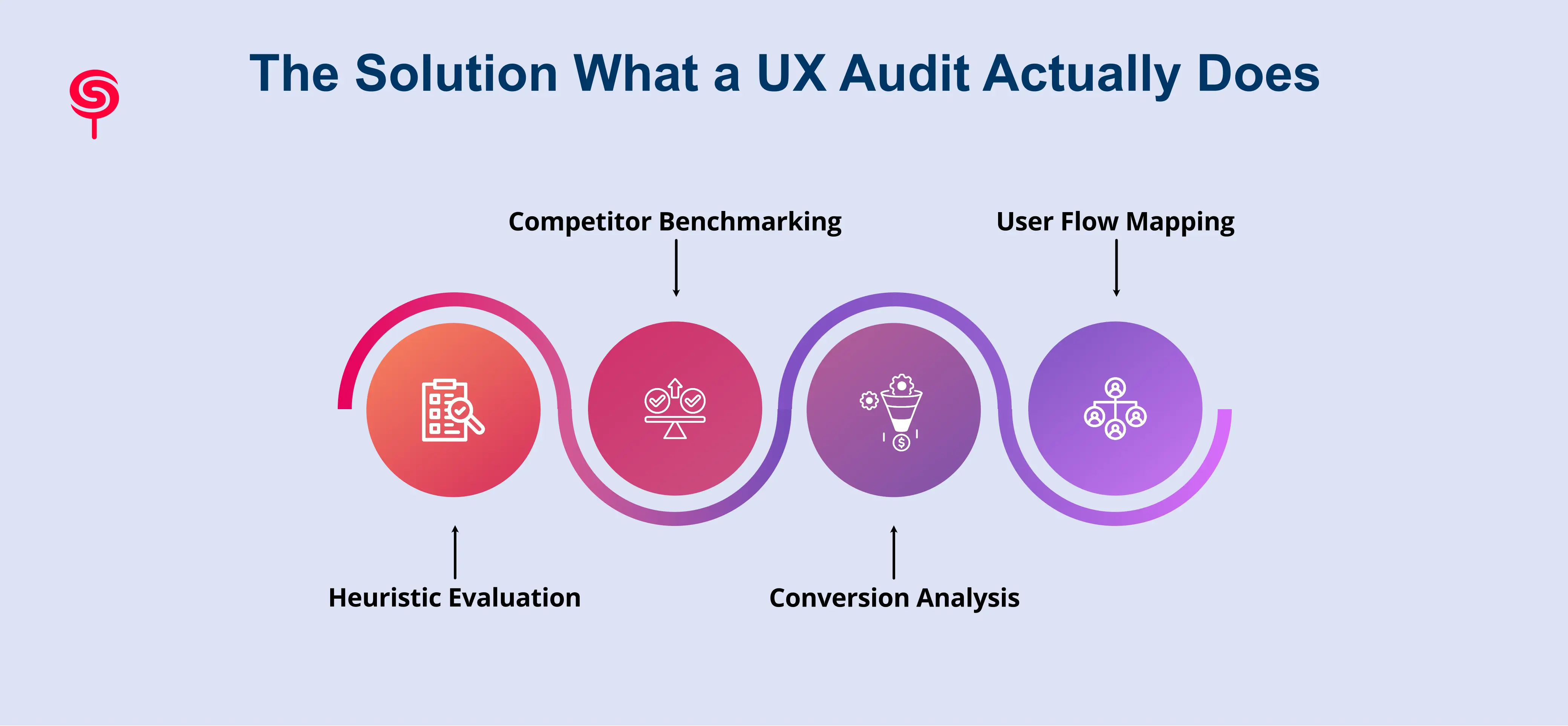
A UX audit is a systematic, evidence-based evaluation of your product's user experience. It isn't a redesign, a rebrand, or a speculative exercise. It's a diagnostic process that produces a prioritized, actionable roadmap of what to fix, in what order, and why.
Here's how a rigorous UX audit is structured:
Heuristic Evaluation
Heuristic evaluation applies established usability principles Nielsen's ten heuristics being the most widely used against every core flow in your product. Each screen, interaction, and state is assessed for visibility of system status, error prevention, user control, consistency, and more.
This surfaces the structural usability failures that user interviews often miss because users don't articulate friction they simply abandon.
For startup UX problems, heuristic evaluation almost always reveals a cluster of issues concentrated around onboarding flows, account setup, and the first-use experience of the product's core feature.
Competitor Benchmarking
Users don't evaluate your product in isolation. They compare your experience against every other digital product they've used including the best-in-class tools in your category and adjacent ones.
Competitor benchmarking within a UX audit maps your product's UX decisions against two to four direct competitors, identifying where your experience falls short of category norms, where you have genuine advantages, and where competitors have set user expectations your product currently fails to meet.
This is particularly valuable for SaaS UX audits because it connects UX decisions directly to competitive positioning something leadership teams understand immediately.
Conversion Analysis
Conversion analysis maps the gap between where users are dropping out and why. It combines quantitative data (heatmaps, funnel analytics, session recordings) with qualitative insight (user interviews, support ticket analysis, exit survey data) to identify the specific friction points costing you conversions.
Unlike a pure analytics review, a UX-led conversion analysis explains why the drop-off is happening not just where. That distinction is what makes the resulting recommendations actionable rather than directional.
User Flow Mapping and Task Analysis
Every product has intended flows and actual flows. A UX audit documents both, tracing the paths users actually take through your product against the paths you designed. The divergences between them are where the most impactful UX problems live.
Task analysis observing how users attempt to complete core tasks surfaces the assumptions your team has built into the product that users simply don't share. These assumption gaps are responsible for the majority of product adoption problems.
Business Outcomes What Changes When You Fix the UX
A UX audit isn't a design investment. It's a business investment with measurable returns. Here's what organizations consistently see after implementing audit findings:
Faster Product Growth
When the path from signup to activation is clear and friction-free, more users reach the moment of value faster. That acceleration compounds: higher activation rates improve word-of-mouth, reduce CAC, and increase the density of engaged users who drive product-led growth loops.
Reduced Churn
Churn is expensive. Depending on your contract values and sales cycle, replacing a churned customer can cost five to seven times what it costs to retain them. UX improvements that make the product easier to navigate, easier to understand, and more consistent in behavior directly reduce the frustration that drives voluntary churn.
Improved Conversion Rates
For ecommerce businesses and D2C brands, even incremental conversion improvements at scale translate into significant revenue. A UX audit that lifts conversion on a high-traffic page from 1.2% to 2.0% on a product doing $500K/month in revenue adds hundreds of thousands in annual revenue without a single new acquisition.
Lower Support Costs
Support volume is a UX metric. When users can't find features, don't understand error states, or get confused during setup, they raise a ticket. A structured UX audit consistently identifies the product changes that reduce support contact rates typically in onboarding, billing management, and account configuration flows.
A Foundation for Scalable Design
Beyond immediate fixes, a UX audit delivers design principles, documented IA, and UI consistency standards that make future product development faster and cheaper. Teams stop debating "how should this work" because the audit established a baseline and deviations from it require justification.
Conclusion
Most products do not fail because the idea is bad.
They fail because the user experience creates friction.
Even strong products lose users when onboarding feels confusing, navigation becomes overwhelming, or workflows require too much effort.
A UX audit helps businesses uncover these hidden problems before they affect growth, retention, and revenue.
For startups, SaaS companies, ecommerce brands, and digital products, investing in UX strategy is no longer optional.
It is one of the fastest ways to improve product adoption, increase conversions, and create long-term customer loyalty.
If your product is struggling with retention, activation, or usability challenges, a UX audit can reveal the opportunities blocking your growth.
Frequently Asked Questions
1. Why do good products fail?
Good products often fail because of poor user experience, confusing onboarding, weak navigation, inconsistent interfaces, and low usability even when the core idea is strong.
2. How does a UX audit improve SaaS products?
A SaaS UX audit helps identify friction points affecting onboarding, activation, retention, and conversions. It provides actionable insights to improve product usability and customer experience.
3. What's the ROI of a UX audit?
ROI varies by product, but common outcomes include a 15–40% improvement in activation rates, a 20–35% reduction in support ticket volume, and measurable conversion lifts on key product pages. The cost of a UX audit is almost always recovered within one to two product cycles.
4. Can a UX audit help with SaaS onboarding specifically?
Yes, onboarding is one of the highest-value areas a UX audit covers. Most SaaS products have significant friction in the first-use experience that, once removed, produces immediate and measurable improvements in trial activation and early retention.
Share this blog!
Latest Blogs
Explore our latest insights on design, AI, and digital innovation.