High Traffic But Low Conversions? Start with a UX Audit
Author
Vignesh
Published On

You’ve driven traffic organic, paid, referral but demo bookings, trial sign-ups, and MQLs aren’t following. High sessions with low conversions is one of the most frequent and most fixable growth problems SaaS startups face. The fix rarely starts with more demand generation. It starts with optimizing the experience you’re already paying to send people to: your website and product flows. A focused UX audit surfaces the hidden conversion bottlenecks, prioritizes fixes by business impact, and creates an evidence-backed roadmap that increases demo bookings, reduces CAC, and accelerates revenue. This guide explains how a UX audit works, why it matters for SaaS, and exactly how CandyStudio runs audits that convert visitors into qualified leads.
What Is a UX Audit and Why Does It Matter?
A UX audit is a systematic, evidence-based evaluation of your digital product or website examining how real users navigate, where they struggle, and what stops them from completing the actions that matter to your business.
Unlike a redesign, which starts with aesthetics, a UX audit starts with behavior. It asks:
Where are users dropping off in the funnel?
Which pages create confusion or hesitation?
Are calls-to-action visible, compelling, and trusted?
Does the navigation reflect how users think or how internal teams organized information?
Is the copy landing, or is it generating cognitive overload?
For SaaS companies, where the sales cycle is driven heavily by digital self-service free trials, demo bookings, product-led growth the quality of the user experience directly determines revenue. A confusing onboarding flow, a vague pricing page, or a buried CTA are not cosmetic problems. They are revenue leaks.
The Most Common UX Issues That Reduce Conversions
Before diving into the methodology, it's worth understanding the patterns that consistently appear in SaaS UX audits. These issues are rarely obvious from the inside they develop gradually, as products evolve, teams add features, and no one steps back to evaluate the whole experience.
Unclear value proposition above the fold. Visitors decide within seconds whether to stay or leave. If the hero section doesn't answer "what is this, who is it for, and why should I care?" with clarity, the bounce rate climbs regardless of ad quality.
Too many choices, too early. SaaS products often present multiple plans, use cases, and personas on the homepage. Decision fatigue sets in. Users leave because they can't figure out which path is theirs.
Friction-heavy sign-up and demo flows. Every additional form field, every redirect, every loading delay between intent and action costs you conversions. Research consistently shows that reducing form fields increases completion rates significantly.
Trust signals buried or absent. Logos of known customers, security certifications, testimonials with real names and roles, and live review scores reduce perceived risk. When they're missing or positioned after the CTA rather than before it conversion rates suffer.
Mobile experience treated as an afterthought. A growing percentage of SaaS buyers first encounter a product on mobile. If the experience is cramped, slow, or difficult to navigate on a smaller screen, first impressions are damaged before the desktop visit even happens.
Navigation that mirrors the org chart. Internal teams organize information based on how they think about their product. Users organize information based on their problems. When navigation reflects internal logic rather than user intent, people can't find what they need and leave.
No progressive disclosure in complex products. When every feature is presented simultaneously, the product looks complex and overwhelming rather than powerful. UX audits frequently identify opportunities to reveal depth gradually showing users what they need when they need it.
How a UX Audit Identifies Conversion Bottlenecks
A rigorous UX audit draws from multiple data sources to build a complete picture of where the user experience breaks down. No single method tells the whole story the real value comes from triangulating across qualitative and quantitative evidence.
User Journey Mapping
Map primary user personas and their intent across acquisition channels (organic, paid, content).
Identify entry points, decision moments, and drop-off points.
Outcome: a prioritized list of journey segments that need immediate attention (e.g., pricing → demo booking flow).
Heuristic Evaluation
Expert review using established usability principles (consistency, affordance, feedback, hierarchy).
Flag obvious usability violations that harm comprehension and trust.
Outcome: quick-win fixes that designers and engineers can implement rapidly.
Funnel Analysis
Track quantitative conversions across stages: visit → view product → sign-up/demo request → activation.
Identify where the biggest percentage of users drop off and segment by traffic source and device.
Outcome: data-driven hypotheses about which pages/steps require intervention.
Heatmaps and Session Recordings
Use behavior tools to see where users click, scroll, and hesitate.
Session recordings reveal hesitation, rage clicks, form abandonments, and confusion.
Outcome: concrete evidence of micro-friction (e.g., CTA below the fold, confusing form labels).
User Behavior Analytics
Analyze event data (clicks, form submissions, time on page) across cohorts.
Segment by persona, source, campaign, and device to understand who converts and who doesn’t.
Outcome: tailored recommendations per persona and channel.
Usability Testing and User Feedback
Conduct moderated and unmoderated tests with target users to validate assumptions.
Use micro-surveys, NPS, and in-app feedback to collect user sentiment and motivation.
Outcome: qualitative reasons behind quantitative drop-offs (e.g., “I don’t see how this integrates with our stack.”)
A Step-by-Step UX Audit Framework for Startups
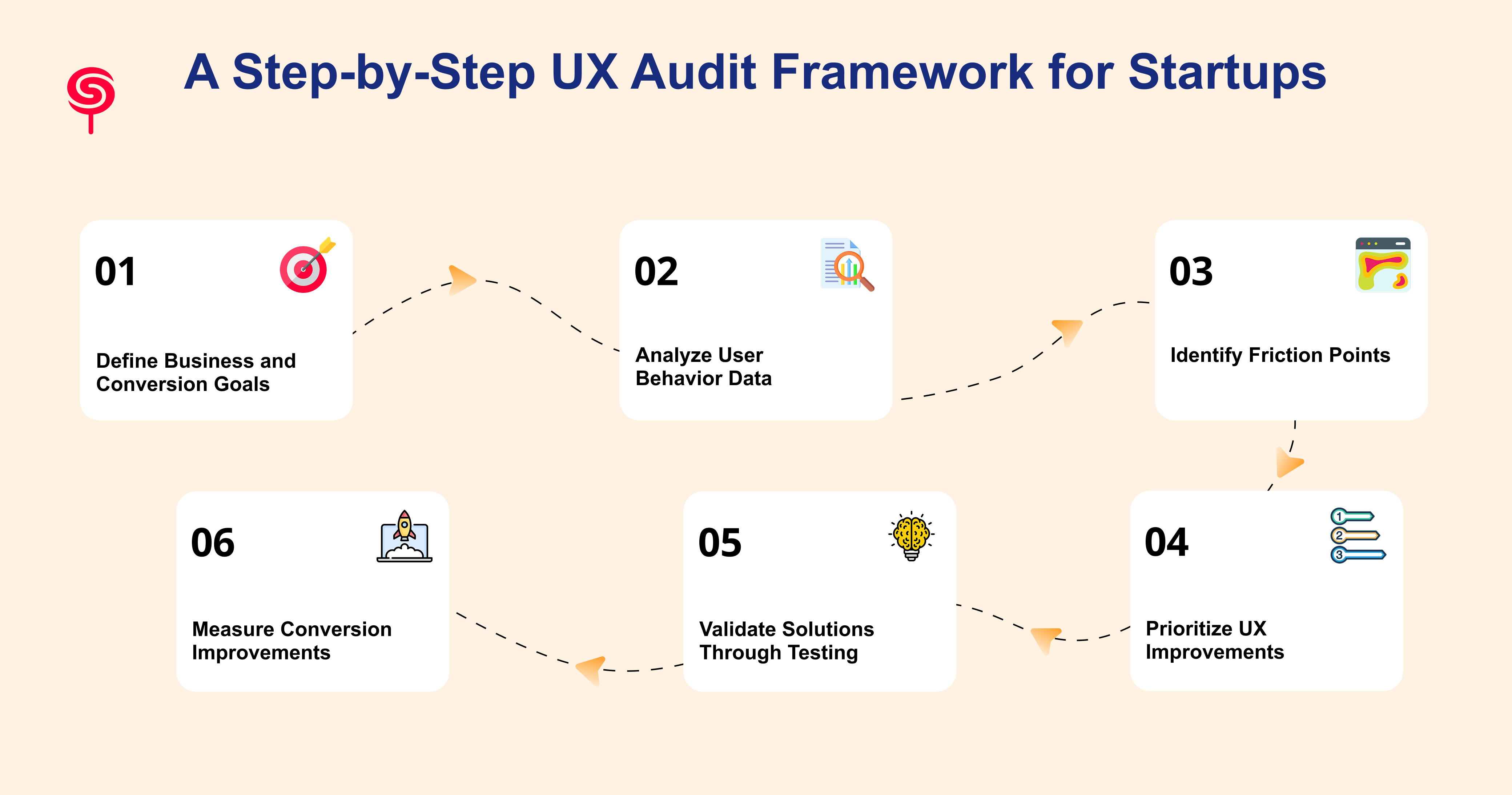
This framework is designed for SaaS companies and AI startups operating with focused resources. It is structured to move from goal-setting through diagnosis to validated action in a logical sequence that produces prioritized, evidence-backed recommendations.
Step 1: Define Business and Conversion Goals
Align with stakeholders: CAC targets, demo bookings per month, trial-to-paid conversion.
Define success metrics and the time frame for improvement.
Example goals: Increase demo bookings by 40% in 90 days, reduce demo drop-off in the booking flow by 30%.
Step 2: Analyze User Behavior Data
Collect baseline metrics: traffic by channel, bounce rates, page-level conversions, funnel drop-offs.
Tools: Google Analytics/GA4, Mixpanel/Amplitude, Hotjar/FullStory.
Create dashboards tracking demo request rate, trial activation, and MQL quality.
Step 3: Identify Friction Points
Run heuristic evaluation, funnel analysis, heatmaps, and session replay reviews.
Capture issues as “observations” with supporting data and estimated impact.
Example observation: 60% of users leave the pricing page before seeing the enterprise plan details, correlating to low demo requests for larger accounts.
Step 4: Prioritize UX Improvements
Use an impact-effort matrix (business impact vs implementation effort).
Prioritize changes that are low effort and high impact (copy clarifications, CTA placement).
Tag items that require A/B testing vs immediate rollout.
Step 5: Validate Solutions Through Testing
Start with A/B tests for copy, CTA placement, and form length.
Run usability tests for complex flows (onboarding, demo booking).
Use sequential testing small hypothesis-driven experiments to avoid large, risky redesigns.
Step 6: Measure Conversion Improvements
Compare key metrics against baseline: conversion rate, demo booking rate, CAC, trial-to-paid conversion.
Track upstream KPIs like time-to-first-value and product adoption.
Feed learnings back into roadmap and iterate.
Real-World Examples of UX Improvements Driving Growth
The Onboarding Bottleneck. A B2B SaaS company in the project management space was seeing strong top-of-funnel conversion: 35% of landing page visitors started the free trial sign-up. But only 18% completed the onboarding flow and reached the core product functionality. A UX audit identified that the onboarding flow required users to complete six configuration steps before seeing any value and that four of those steps could be deferred until after the user had experienced the core feature. After restructuring the flow to deliver a value moment within two minutes of sign-up, onboarding completion increased by 47%.
The Trust Signal Gap. A Series A AI startup was generating traffic from thought leadership content but converting less than 1.2% of visitors to demo requests. A heuristic evaluation and session recording analysis revealed that the homepage positioned customer logos and social proof below the fold meaning the majority of visitors left before seeing any evidence that the product was trusted. Repositioning trust signals to appear within the hero section and adding a real-time customer count to the CTA section drove demo conversion from 1.2% to 3.1% within 30 days.
The Navigation Mismatch. A SaaS platform serving operations teams had organized its navigation around product features (Automation, Reporting, Integrations, Templates). User research conducted as part of a UX audit revealed that buyers navigated by use case (Reduce Manual Work, Track Team Performance, Connect My Tools, Get Started Fast). Restructuring navigation to reflect user intent language reduced homepage bounce rate by 22% and increased time-on-site by 40%.
The Business Benefits of Conducting a UX Audit
Increase Website Conversion Rates
The direct outcome of fixing identified friction points is a measurable increase in conversion rate. For SaaS companies investing in paid acquisition, a 2x improvement in conversion rate effectively doubles the return on existing ad spend without increasing budget.
Generate More Qualified Leads
UX audits frequently surface misalignments between traffic quality and messaging clarity. By tightening the connection between user intent (what search queries or ads bring them in) and on-page experience (what they see when they arrive), audits help generate leads that are better qualified reducing time-to-close and improving sales efficiency.
Reduce Customer Acquisition Costs
When more of the visitors your marketing generates convert into trials or demos, your cost per acquisition falls even with the same ad spend. UX improvements compound over time: a conversion rate improvement achieved through a UX audit continues to pay dividends on every future campaign.
Improve Product Adoption
For SaaS companies, acquisition is only half the equation. If users sign up but don't adopt the core product, churn follows. UX audits that extend into the product experience examining onboarding, feature discoverability, and activation flows directly improve the metric that matters most for long-term revenue: whether users actually use what they signed up for.
Increase Customer Retention
Retention is a UX problem as much as a product or customer success problem. Confusing interfaces, hard-to-find features, and friction-heavy workflows drive churn. Identifying and resolving these issues through a UX audit is one of the highest-ROI investments a SaaS company can make in retention.
Accelerate Revenue Growth
The compounding effect of higher conversion rates, lower acquisition costs, better product adoption, and improved retention is accelerated revenue growth. For AI startups and SaaS companies operating in competitive markets, the UX audit is a strategic lever not just a design project.
Why SaaS Startups Should Prioritize UX Audits Before Redesigns
One of the most expensive mistakes in SaaS growth is commissioning a full website or product redesign as the response to low conversion rates without first understanding why the existing experience isn't working.
Redesigns are costly, time-consuming, and disruptive. They introduce risk: the new experience may look better without performing better, because the underlying problems were never diagnosed. Teams spend months building something new while the same conversion bottlenecks migrate from one design to the next.
A UX audit changes the equation. It generates specific, evidence-backed answers before a single pixel is moved. It tells the design team which problems to solve, which assumptions are wrong, and which elements of the existing experience are actually working and should be preserved.
The result is a redesign (when one is genuinely warranted) that is grounded in real user behavior and aligned to defined business goals. The investment in a pre-redesign audit consistently reduces the total cost of the redesign by eliminating unnecessary iterations, focusing the scope, and ensuring the brief reflects real user needs.
For startups and scale-ups operating with constrained resources and time pressure, this discipline is not optional. It is the difference between a redesign that moves the needle and one that moves the aesthetic.
How CandyStudio Conducts UX Audits
At CandyStudio, we approach UX audits as business strategy engagements, not usability reports.
Our audit process begins with a discovery session in which we align on your specific business goals: which conversions matter, what your current baseline metrics are, and what success looks like for the engagement. We then execute a structured audit across five dimensions: user journey mapping, heuristic evaluation, quantitative funnel analysis, behavioral data review (heatmaps, session recordings, analytics), and when appropriate targeted user research.
Our UX audit deliverables include:
A comprehensive conversion friction report with annotated screenshots and behavioral data
A prioritized UX improvement roadmap with estimated impact for each recommendation
A 30-minute executive readout session to walk leadership through findings and align on next steps
Optional: implementation support through our SaaS design team for rapid execution
CandyStudio works with AI startups, SaaS companies, and product-led growth teams at the Series A through Series C stage where the conversion rate on a well-designed digital experience has a direct and measurable impact on ARR.
Conclusion
High traffic and low conversions is not a traffic problem. It is a user experience problem and it has a diagnosis.
A UX audit gives you the evidence to stop guessing and start fixing. It identifies exactly where users are dropping off, why they're leaving, and what changes will move your conversion rate in the right direction. For SaaS founders, product managers, and growth leads navigating competitive markets, it is one of the highest-leverage investments available: the findings are specific, the improvements are measurable, and the impact on revenue compounds.
Frequently Asked Questions
1. How do I increase my website's conversion rate?
The most reliable path to higher conversion rates is diagnosing why your current rate is what it is through a structured UX audit before implementing changes. Common high-impact interventions include clarifying the value proposition, reducing form friction, repositioning trust signals, improving mobile experience, and aligning CTA copy with the user's specific intent at each stage of the funnel.
2. How do I know if my SaaS website needs a UX audit?
If your website has meaningful traffic but a conversion rate below your category benchmark, if your cost per acquisition is rising while lead quality stays flat, if users are starting but not completing your sign-up or onboarding flow, or if you're planning a redesign and want to ensure it's grounded in evidence a UX audit is the right next step.
3. How do I measure success after a UX audit?
Track demo booking rate, conversion rate by funnel stage, CAC, trial-to-paid conversion, and time-to-first-value. Compare against a pre-audit baseline and use significance-tested A/B results.
4. Can a UX audit improve demo bookings?
Absolutely. Many SaaS companies improve demo requests by simplifying navigation, strengthening messaging, optimizing landing pages, and reducing friction throughout the conversion journey.
Share this blog!
Latest Blogs
Explore our latest insights on design, AI, and digital innovation.


